Vale – Mt Lawley

CLIENT BRIEF
Our clients wanted to update their ensuite in line with the federation style of the home, but with a modern twist.
Requests:
- Open and bright
- Shower, toilet and vanity
- Storage
- Work within the existing space
Before
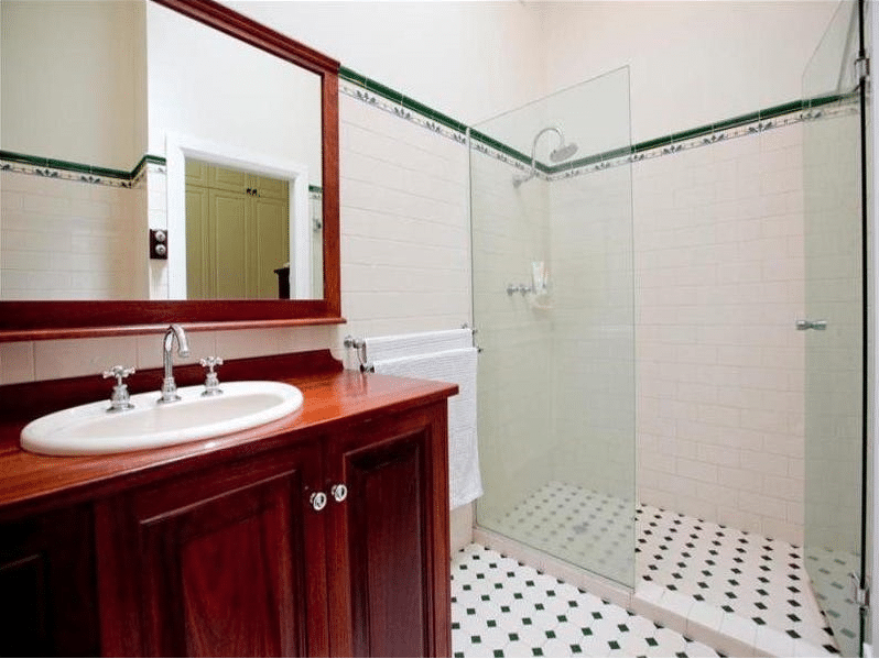
Previously this ensuite felt cramped an enclosed shower, darker coloured elements and limited natural light, given it is in the centre of the house.
After
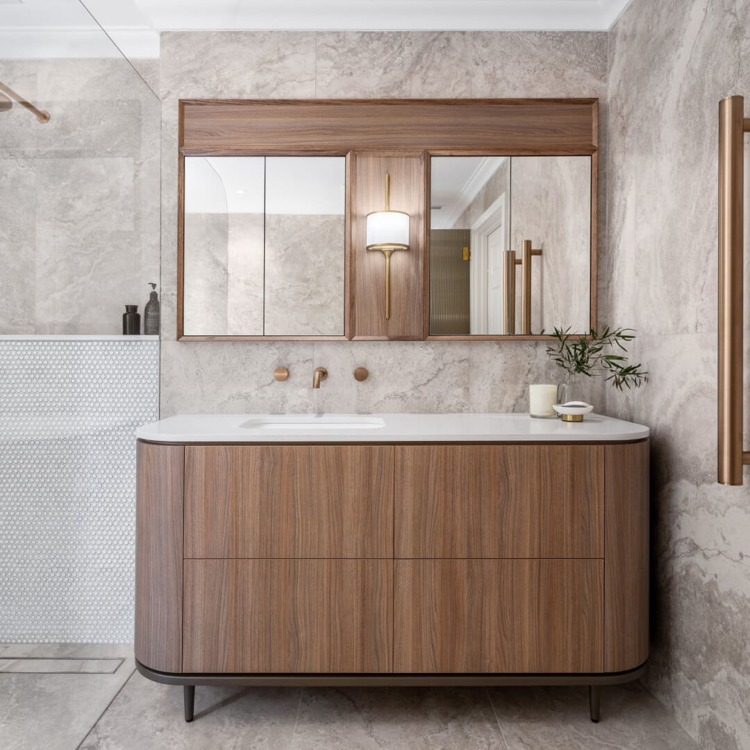
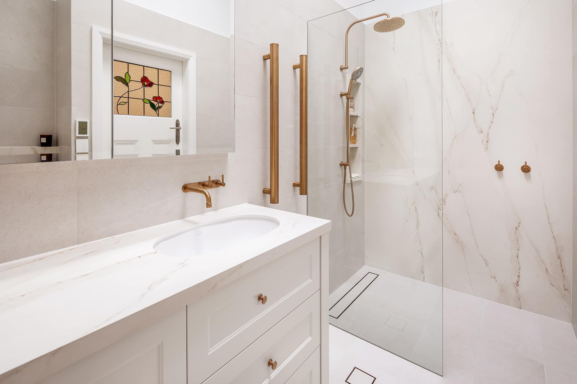
Working within a small space, means an even higher importance is placed on innovative design solutions. In our design, we wanted the room to feel open, bright and larger than it actually was. We knew we were unable to extend outwards, so we went up. By opening up the ceiling and inserting a skylight, it let in an abundance of natural light and made the room feel larger. We also recommended a lighter colour scheme, to allow the light to bounce off the walls and floor, with touches of Roma Bronze in the Brodware tapware and accessories.
A Walk-In Shower
The layout of the room was kept the same, however through smart use of bath ware, cabinetry, and storage we created more useable space for the clients. As you enter the room, we created a walk-in shower on the right that features a built-in niche with three levels.
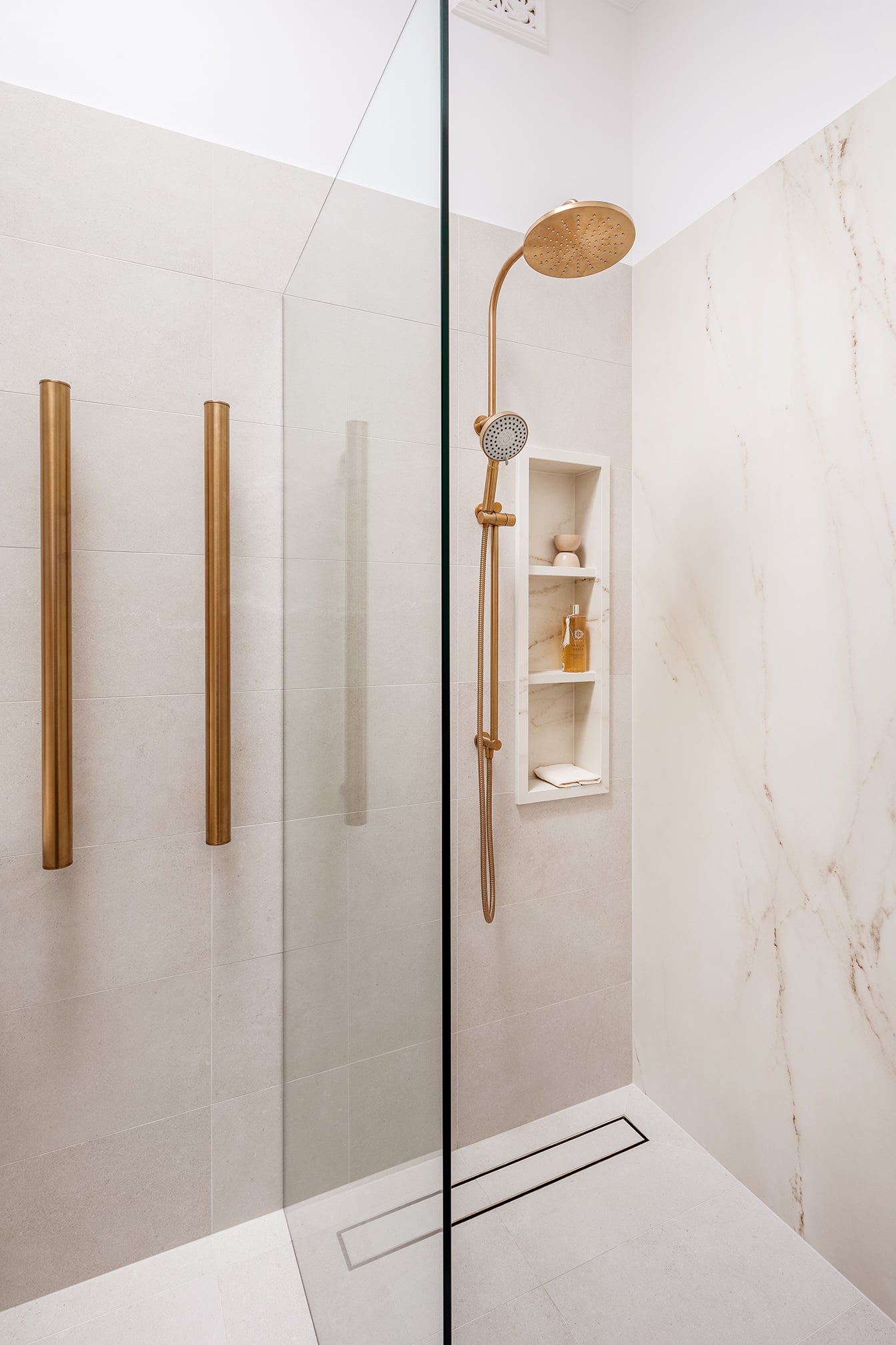
The niche is made from Dekton, an engineered stone look panel, that was set out to make it a feature. We chose a fixed shower head with a hand held below, and a strip drain for optimal drainage in an open shower. The removal of the shower screen door makes it feel more open and there’s no need to allow room for the door to open.
Vertical Heated Towel Rails
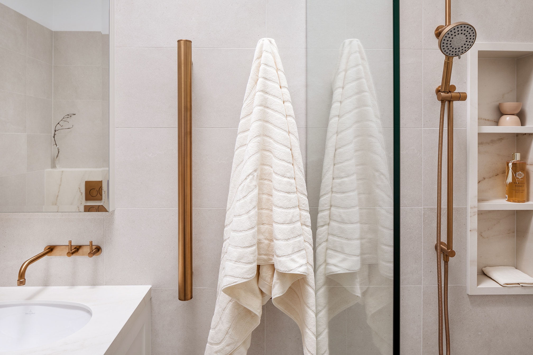
To the left of the shower, we used two vertical towel rails which worked with the space, as there would not have been enough room for horizontal rails. Aside from the space, our preference is to use vertical rails because practically we find they work better for heating.
Federation Style Vanity
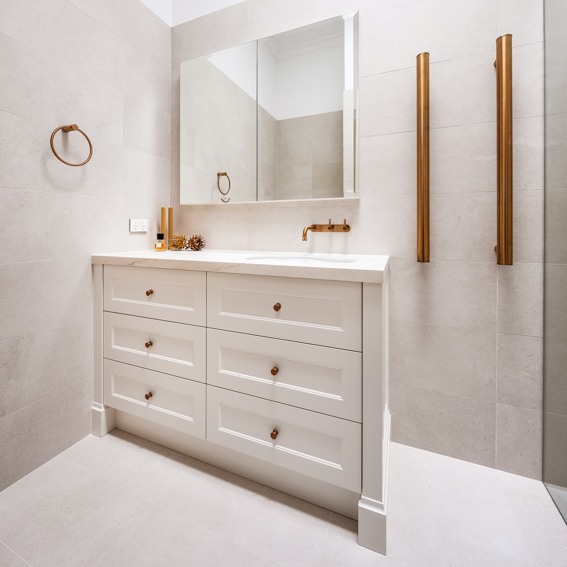
On the left-hand side of the ensuite is the floor mounted vanity in a traditional profile to work in with the style of the federation home. The vanity has plenty of storage with its set of triple drawers in a shaker profile. Above the vanity sits the mirrored cabinetry which is recessed into the double brick wall so that it’s not protruding out.
Wall Hung Toilet
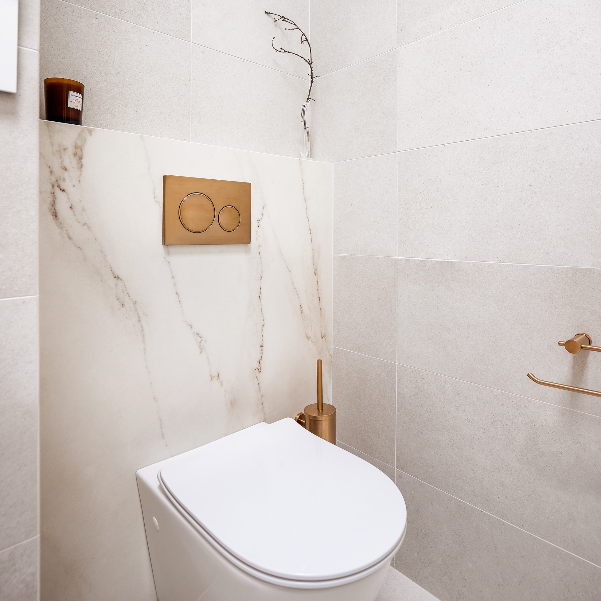
Opposite the vanity sits the wall hung toilet with an inwall cistern and matching bronze buttons. The cistern wall is clad in the same Dekton stone look panels, which is featured throughout the room.
This ensuite is a prime example of how a small space can be made to feel open and bright whilst still creating plenty of storage, without compromising on functionality.
Recent projects
Lux Interiors is passionate about creating premium bespoke renovations to suit our client’s desires, budgets, and unique requirements. View some of our latest renovation projects – designed and renovated with care and precision by our design & build team.