Riley
Minimalist x Federation Home Renovation
In Collaboration with Carmen Hansberry Design

Client Brief
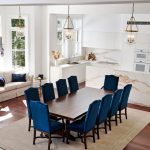
When purchasing the house, our clients fell in love with the high ceilings, north-facing family room/kitchen area and elegance in its heritage style. However, the spaces felt tired and outdated and needed a freshen-up to bring it into a more contemporary style whilst respecting the heritage details, and utilised unused spaces.
Requests:
- Create a light, flowing and minimalist kitchen and dining area that was refined but didn’t’ take away from the federation heritage characteristics
- Create bathrooms with enhanced natural light and circulation, currently they feel cramped.
- Enhance storage throughout, especially in the bathrooms where there was limited storage.
- Easy to clean spaces through smart planning.
- High quality finishes, fittings and workmanship throughout.
Before
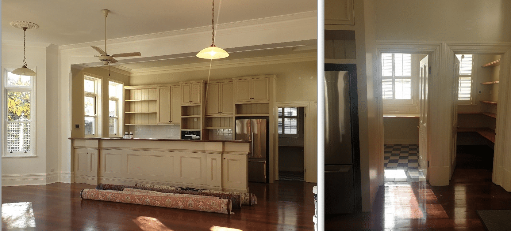
Previously this kitchen was outdated and felt tired even with the abundance of natural light streaming through. The U-shaped layout included an up-stand, two sinks open shelving and staked ovens. The walk-in was simple with open shelving from floor to ceiling.
After
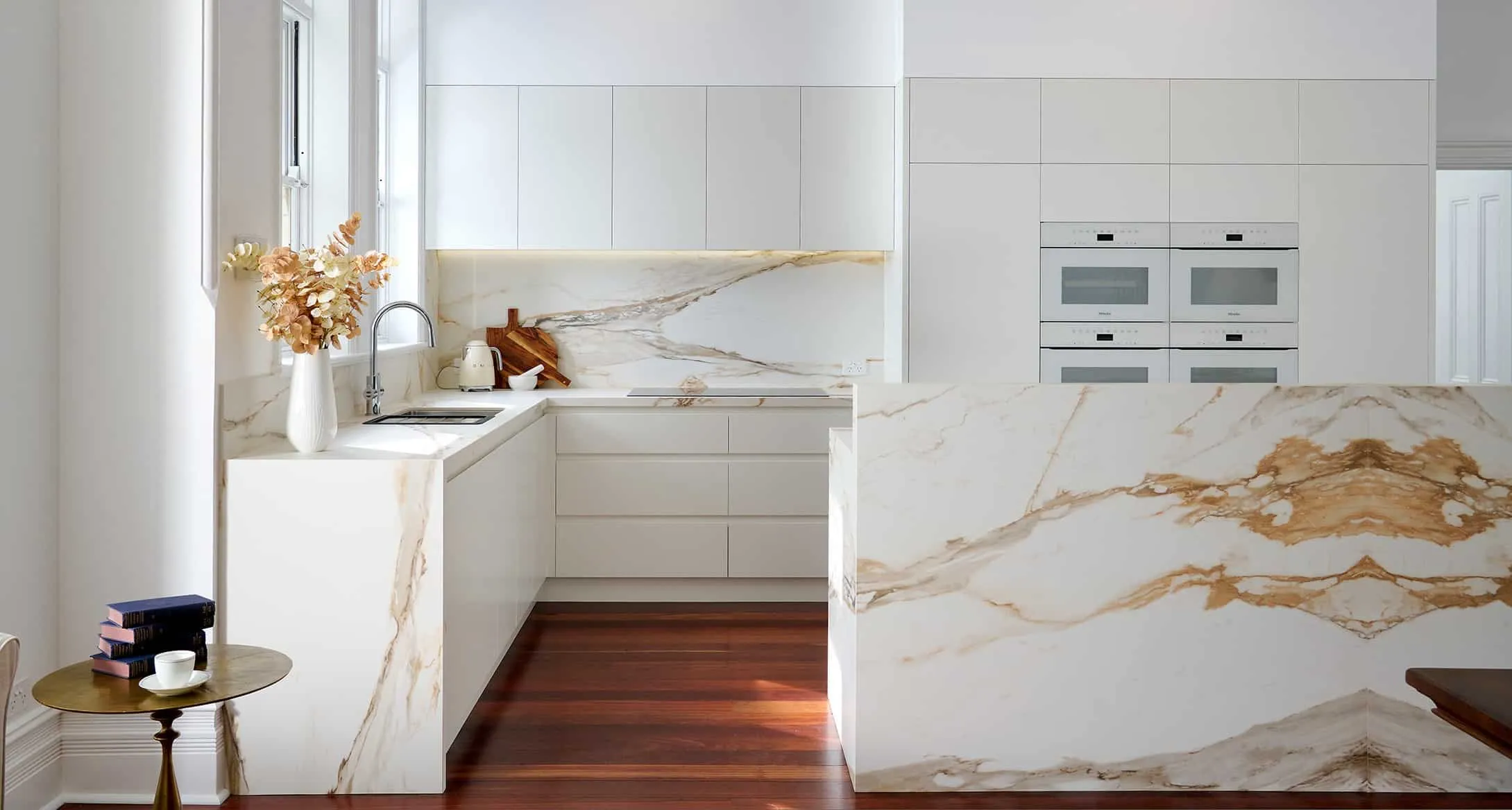
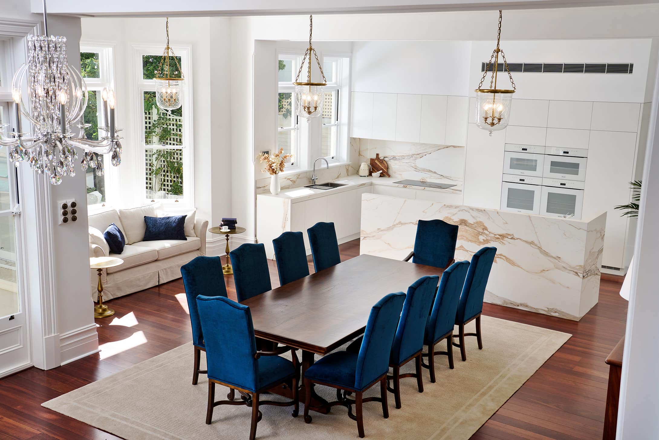
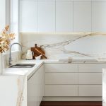
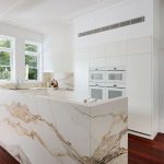
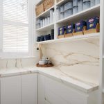
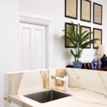
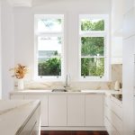
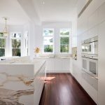
Carmen’s design opens up the space by removing the peninsula and creating an island bench with book-matched porcelain panels in Calcutta Macchia Vecchia. The execution of these large format porcelain tiles required precision and patience to line them up to the millimetre and wrap around the bench perfectly. The cabinetry design was seamless and minimalist, with mitered joins, and vein matched benchtop and splashback. The pantry became a mini butler’s pantry with an L-shaped benchtop for small appliances, open shelving overheads and a tall open shelf unit for all your storage needs.
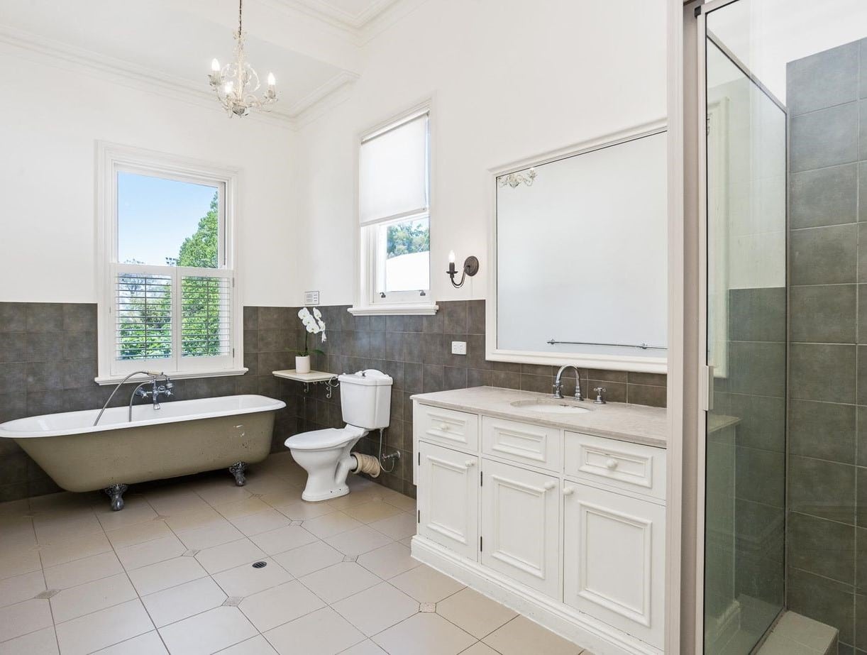
Before – Upstairs Bathroom
Before the renovation, the bathroom exuded a dated and tired atmosphere. The worn-out floor and faded tiles on the walls failed to harmonise, making the space feel cramped and uninspiring.
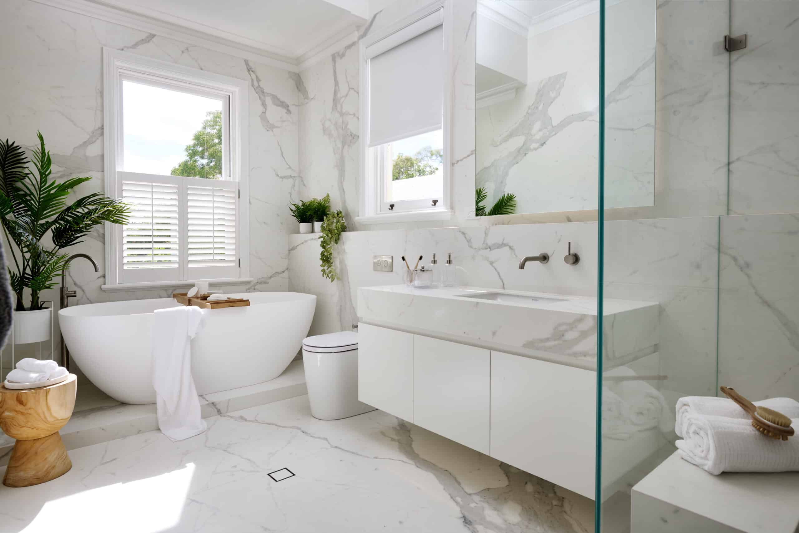
After – Upstairs Bathroom
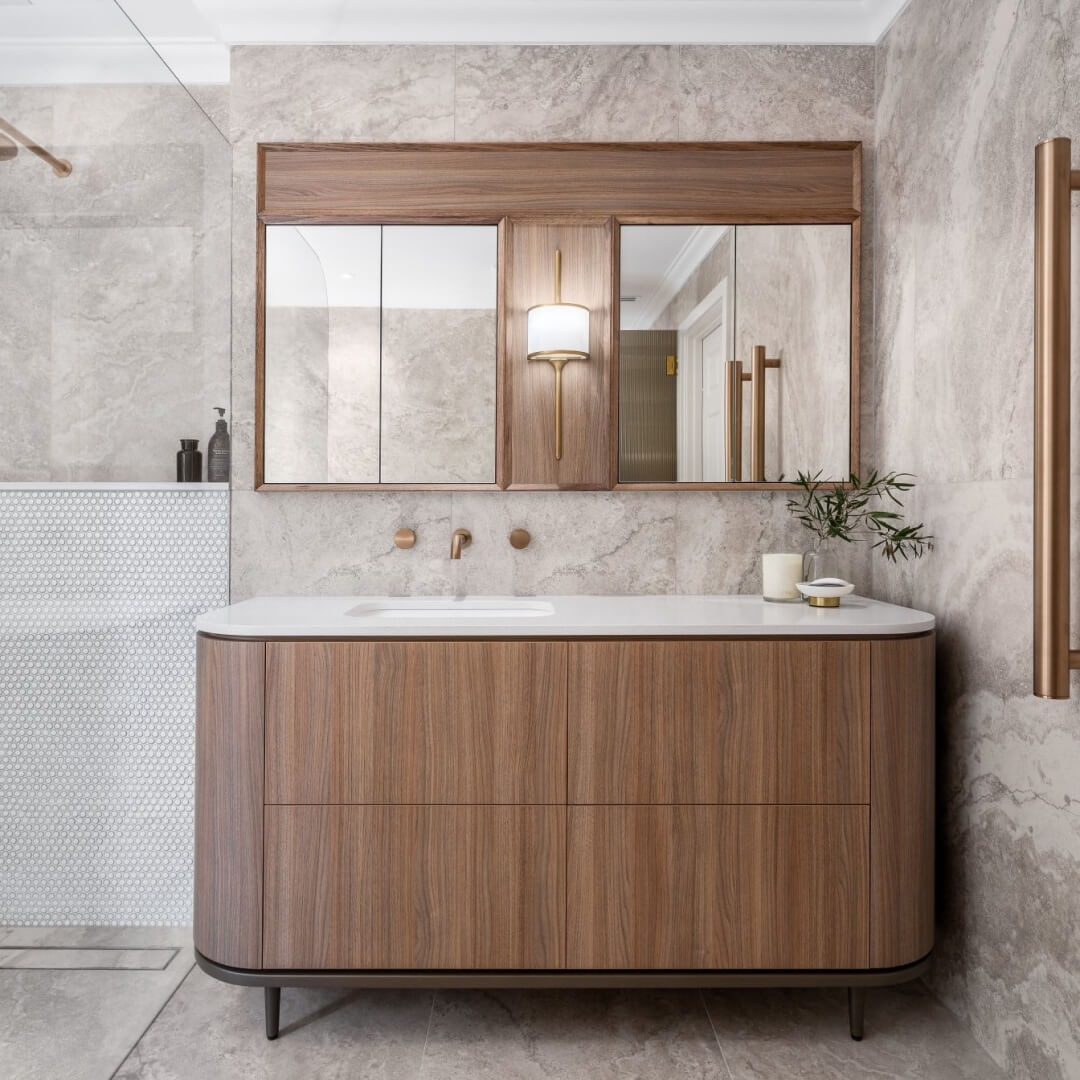
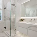
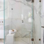
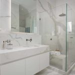
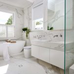
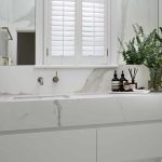
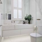
A light and refined aesthetic was achieved using marble-look floor and wall tiles that enlarge the space and complement the existing home. Large format panels were used to minimize grout lines and create a sleek look. Brushed nickel tapware and accessories complement the veining in the panels and vanity top.
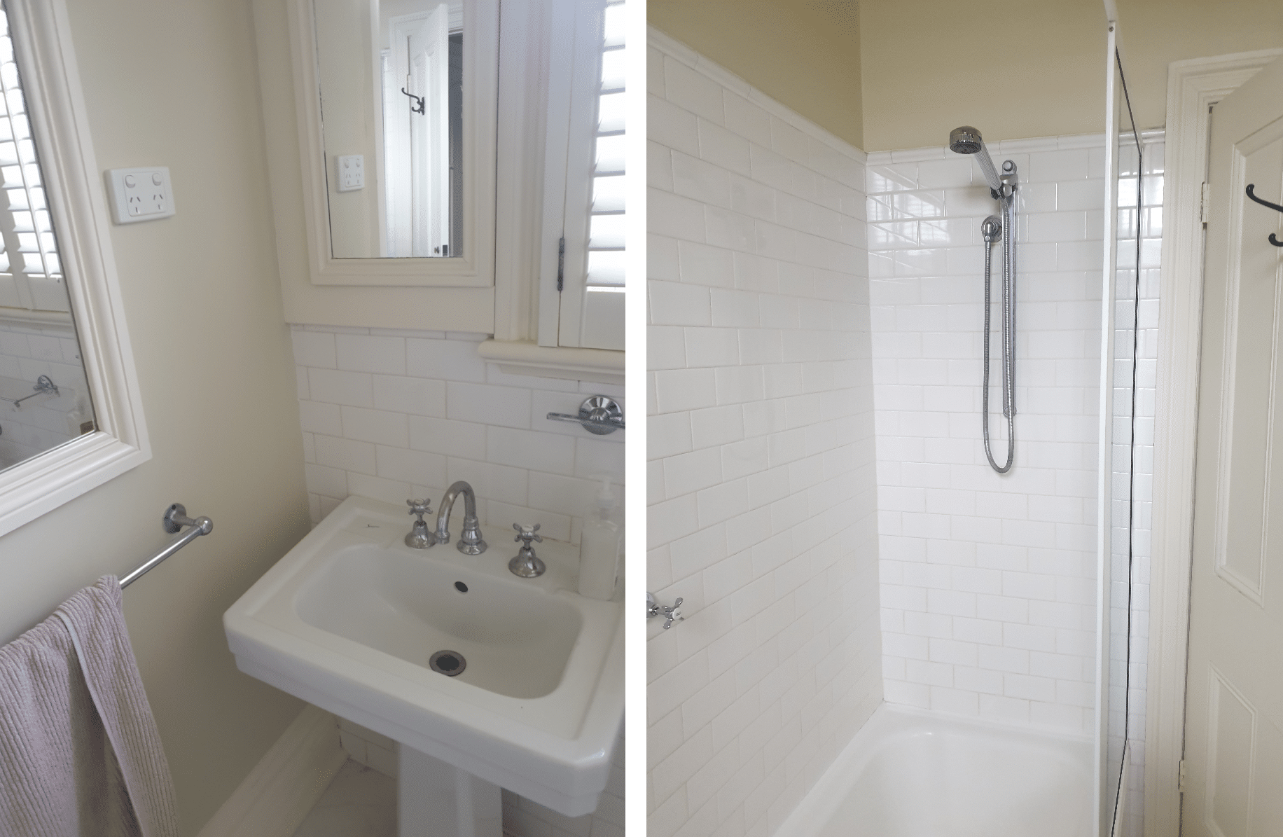
Before – Downstairs Bathroom
The downstairs bathroom underwent a significant transformation as the dated bath, overhead shower, and toilet nib wall were dismantled to pave the way for a more spacious and contemporary design.
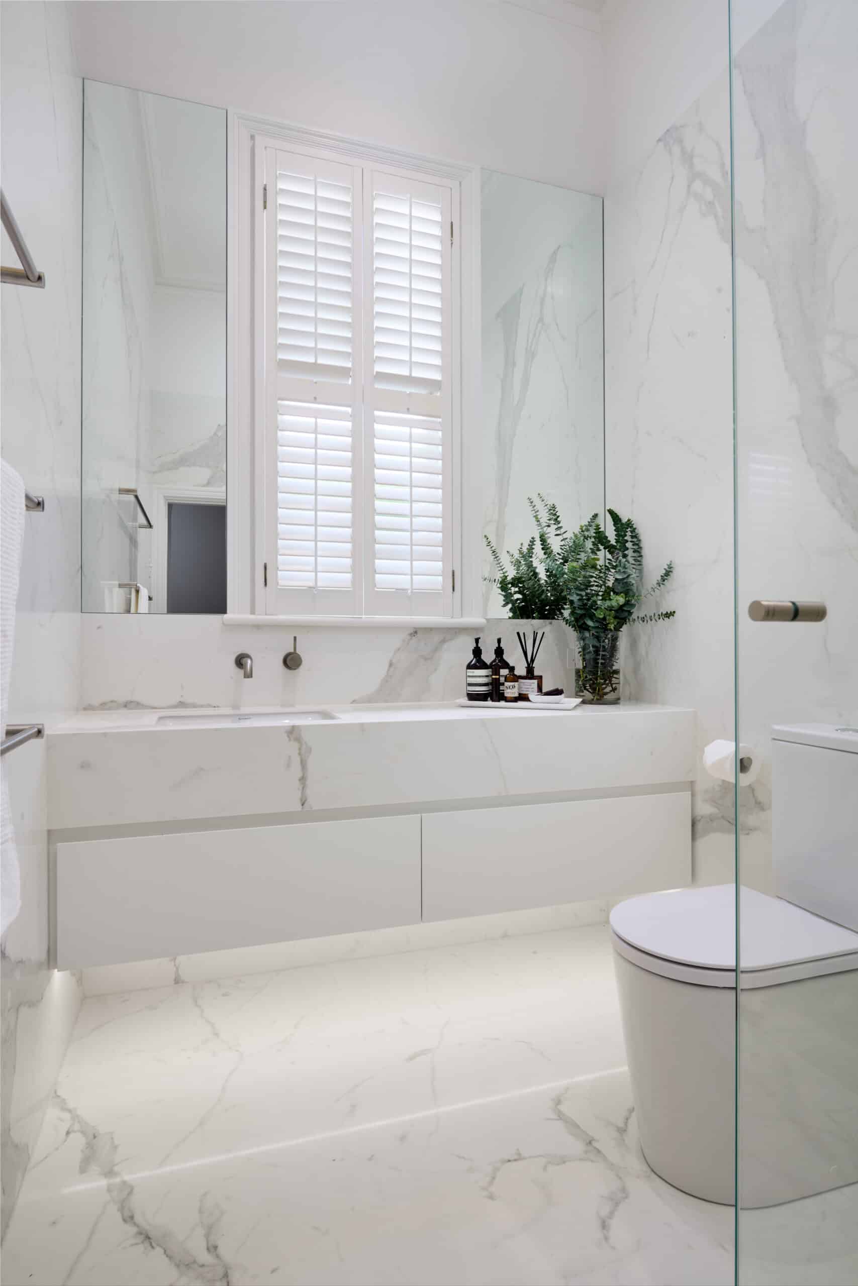
After – Downstairs Bathroom
The existing bath with overhead shower and toilet nib wall were removed to make room for a large frameless shower, new back to wall toilet suite and double vanity. The improved layout not only makes the room seem larger, but it also provides a more functional bathroom experience.
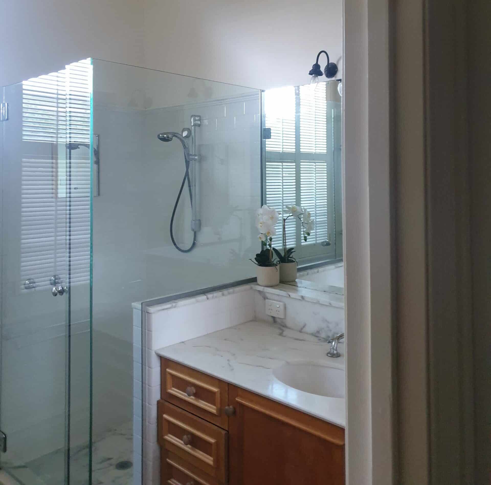
Before – Downstairs Ensuite
The original configuration of the downstairs ensuite, while meeting the client’s preferences, displayed opportunities for enhancements in both appearance and functionality.
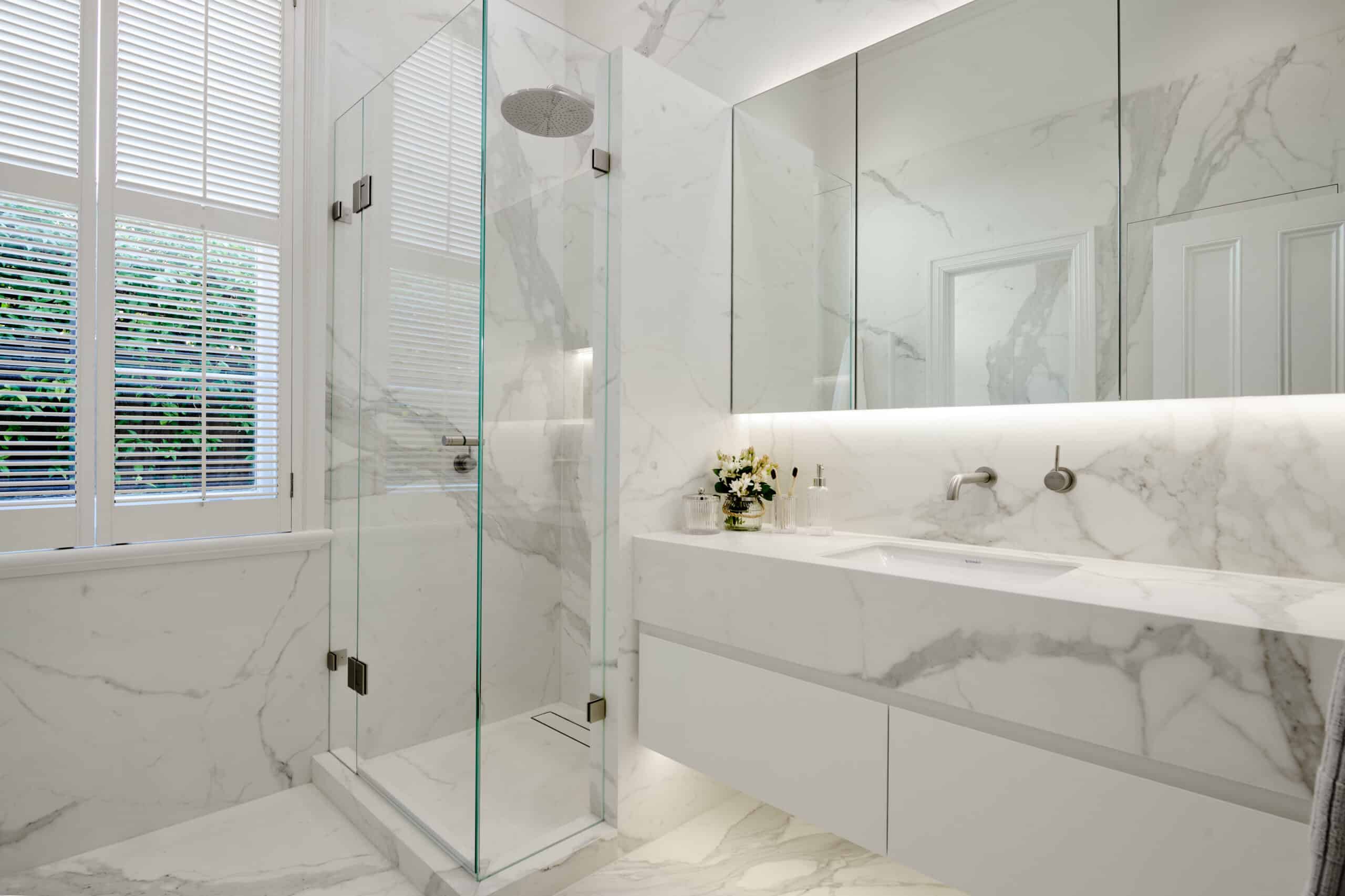
After – Downstairs Ensuite
Whilst the existing layout suited the client, improvements could be made to the appearance and functionality of the room. The existing shower nib wall was removed and replaced with a new nib wall that allowed for the seamless installation of the vanity and mirrored storage unit. The improved layout not only makes the room seem larger, but it also provides a more functional bathroom experience.
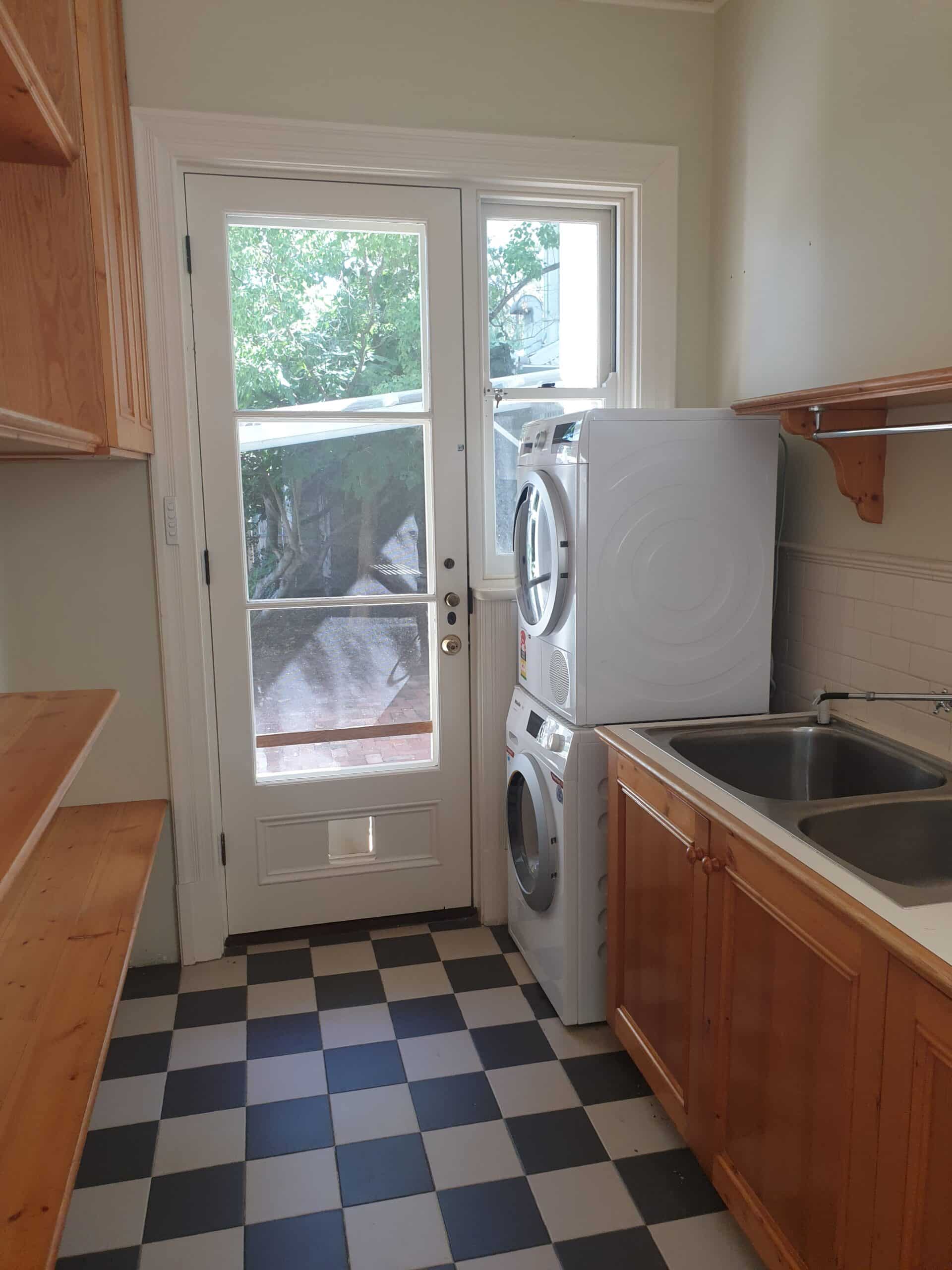
Before – Laundry
Previously this laundry felt cramped and unorganised with the mismatched style, including checkerboard tiles on the floor, traditional base cabinetry and open shelving with washer and dryer stacked on top of each other. The placement of the wash and dryer sheltered the natural light from coming in and being so close to the wall the doors were unable to be opened fully.
After – Laundry
We utilised the natural light and length of the room by building base cabinetry all along the side, with framing for the washer and dryer, based on Carmen’s design. The sink has been mounted with the mixer at the end of the bench, closest to the outside door. Between the two windows, we have built over head cabinetry with a hidden hanging rail that allows plenty of room for longer clothing items. The cabinetry has been built to finest details, including a shadow line detail on the base cabinetry and mitered edges on the overhead cabinets.
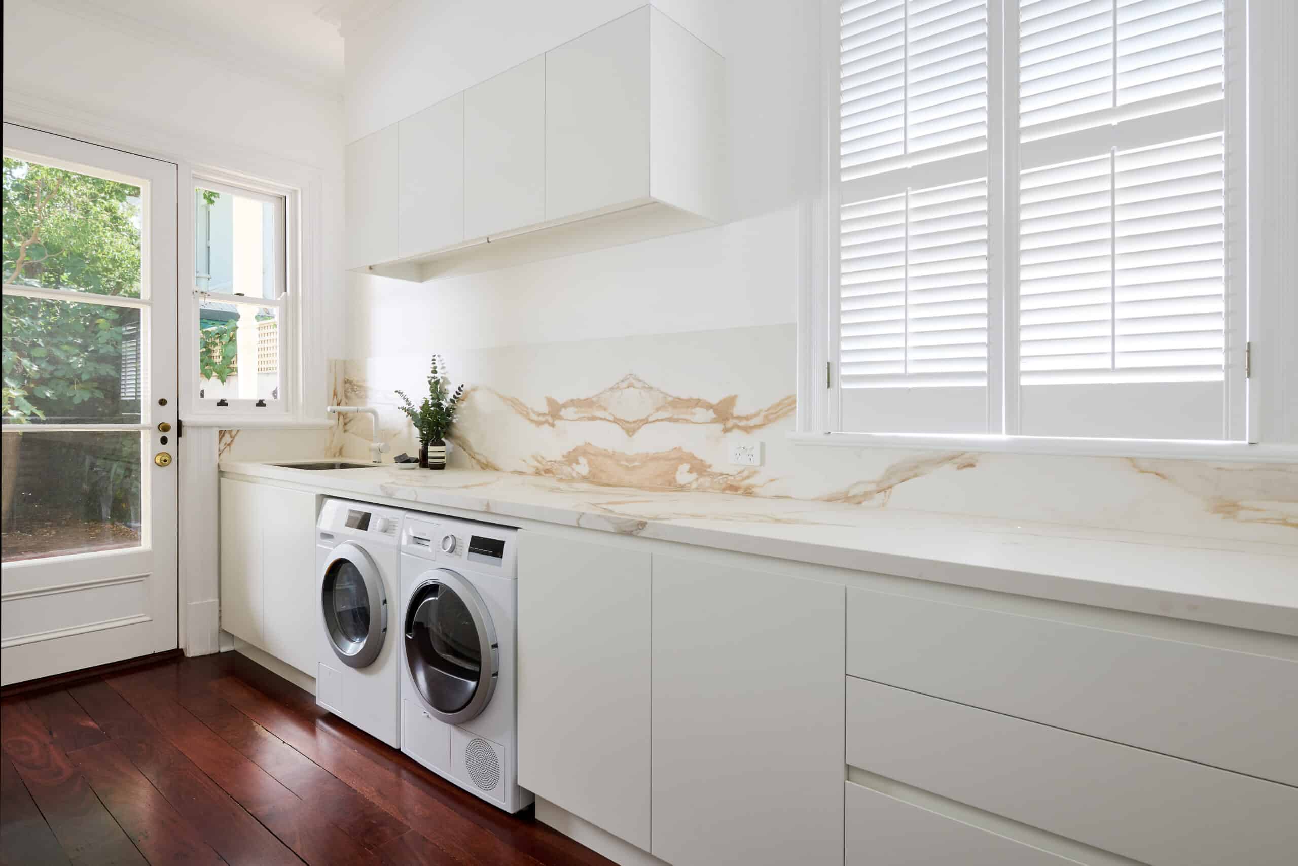
Opposite the washer and dryer is tall cabinetry that fill the entire left hand side of the room for optimal storage. The chosen colour scheme and stone look porcelain benchtop brings a sense of clam and relaxation to this room that ties in perfectly with the traditional character of the home.
Full Home Transformation



Recent projects
Lux Interiors is passionate about creating premium bespoke renovations to suit our client’s desires, budgets, and unique requirements. View some of our latest renovation projects – designed and renovated with care and precision by our design & build team.