Powell

CLIENT BRIEF
A Hamptons style kitchen that is light and bright.
Requests:
- Keep the layout and flooring
- Optimise the storage functionality
- Lighten the space
- Hamptons style to match the rest of the living space furniture.
Before
Previously this kitchen had dark cabinetry that didn’t align to the client’s style, it was poorly lit and lacked adequate storage. The pantry had basic shelving with a cut out for appliances which was never used by the client. There was a canopy rangehood hung over the stove and near the sink was a box of electrical cords and WiFi modem that sat on the benchtop, cluttering the room and reducing useable bench space.
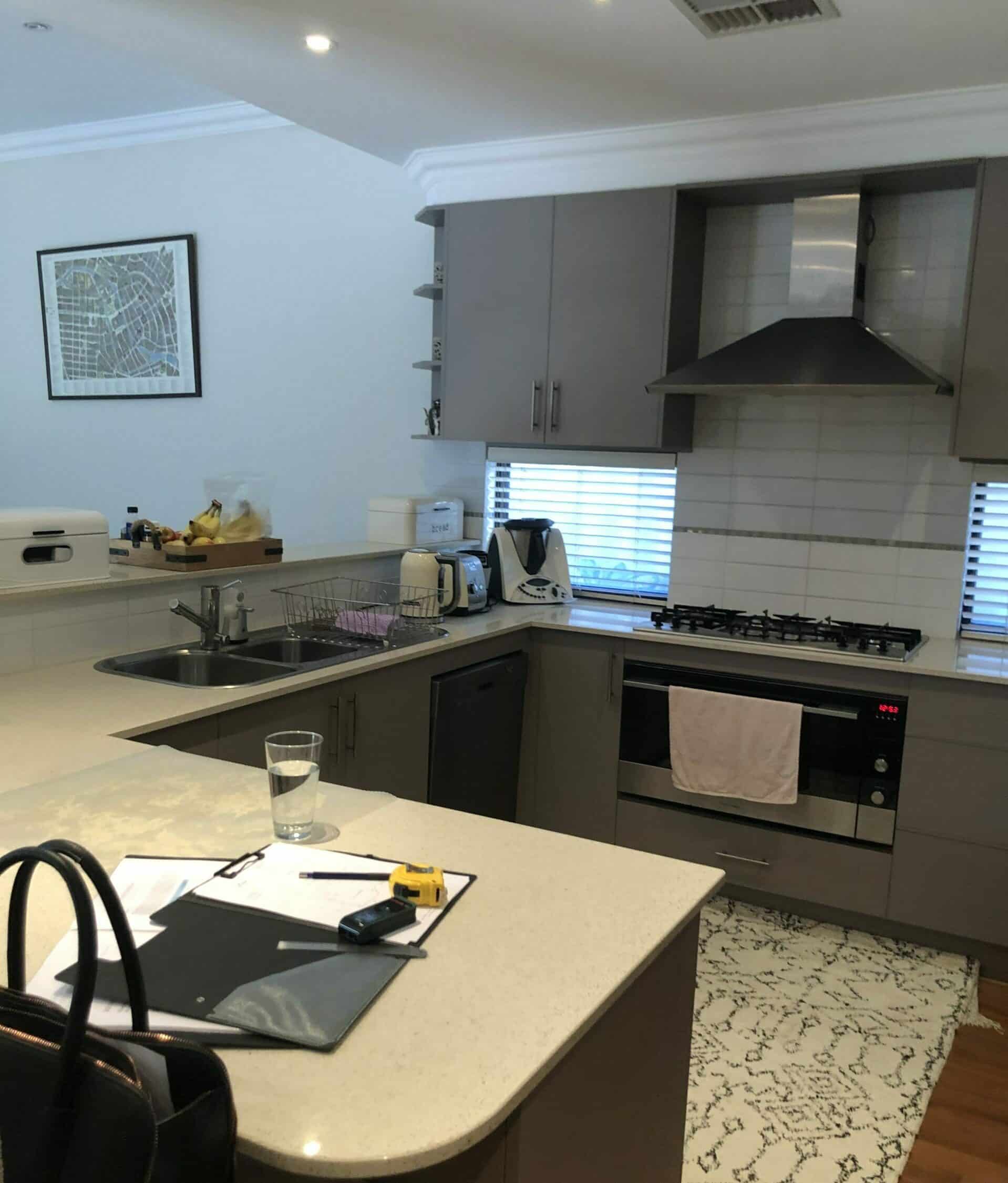
Even though it was a small kitchen area, it was not being used to its full potential which is where we came in to repurpose unused space.
After
Our design uses a light and bright colour scheme that is shown in the cabinetry and benchtop. This meant that we were able to reflect the limited natural light around the room making it feel brighter and larger. This colour scheme is also in keeping with the Hampton’s style.
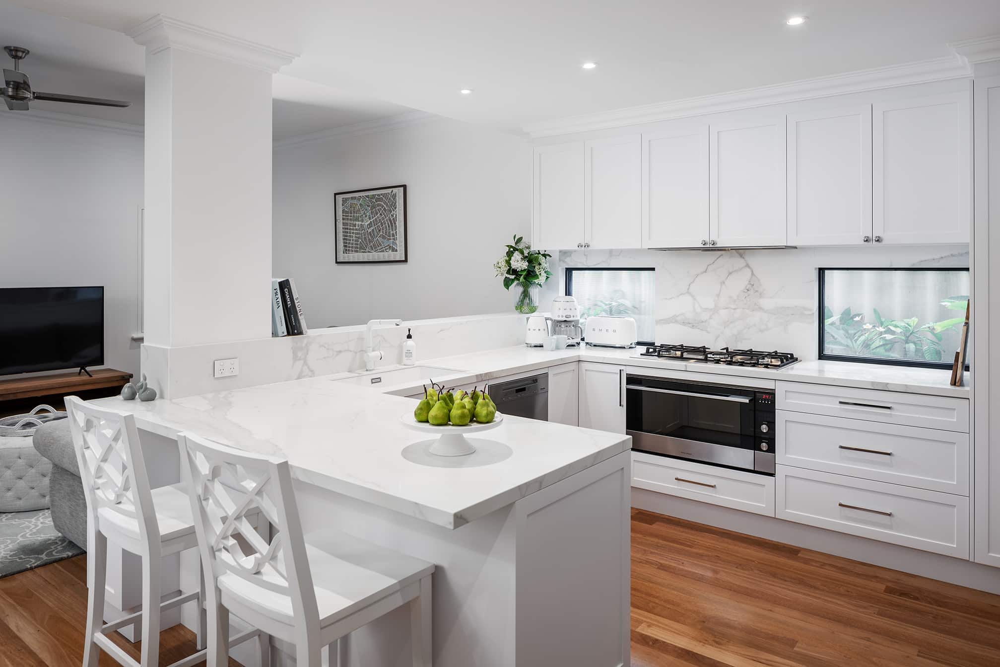
We made adjustments to the locations and type of appliances to create additional storage, better functionality and a more streamline look. Overall, the client is immensely happy with the outcome.
Repurposing Unused Space
This design transforms unused space into storage. In the under bench corner cabinetry we’ve included a 3/4 carousel and a Le Mans corner unit. The dishwasher has been shifted closer to the sink and changed to a built-in unit so that it has the same kicker height as the rest of the cabinetry. This also allows for better access to the corner storage unit and better functionality being closer to the sink.
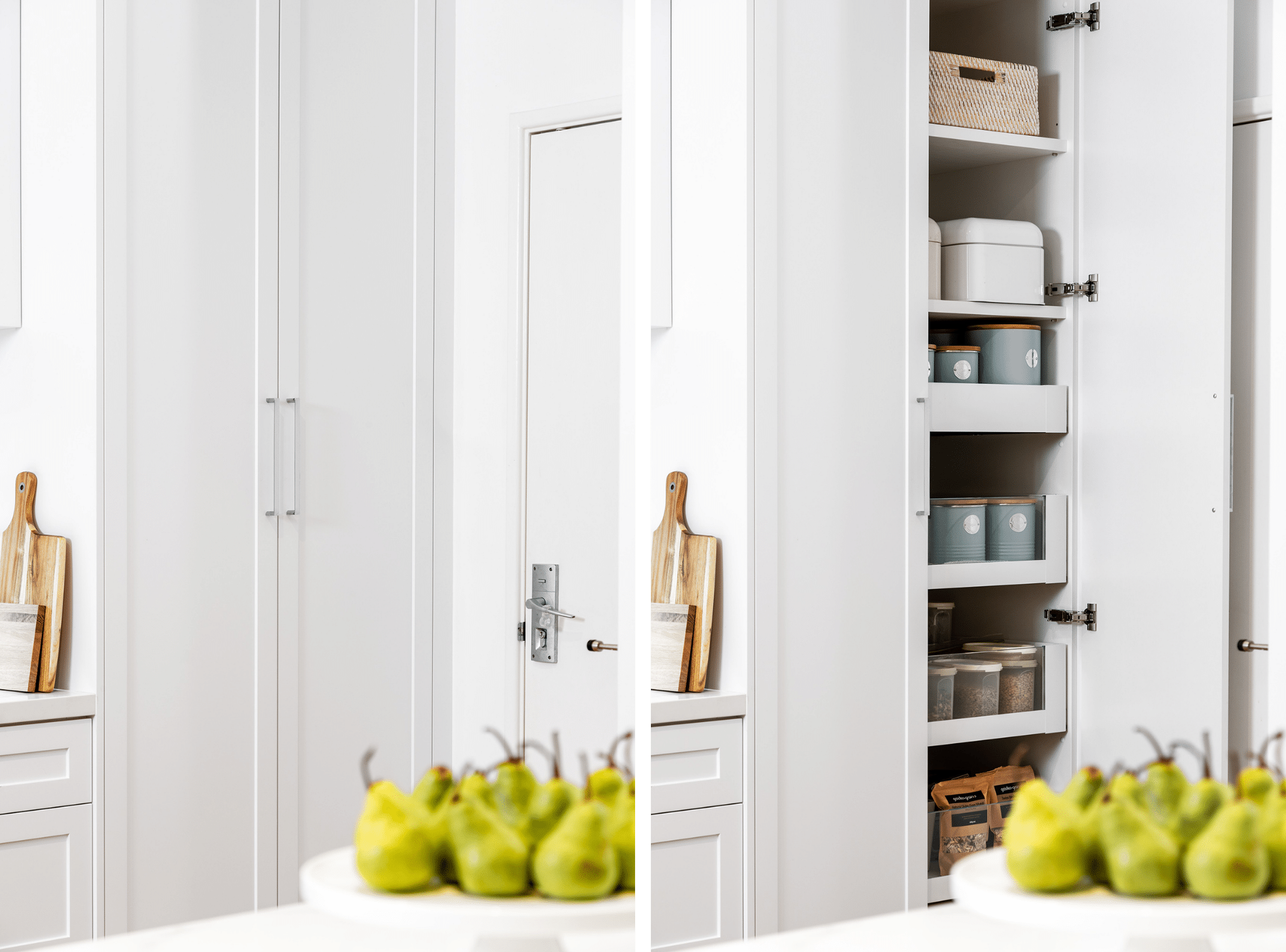
The replacement of the canopy rangehood with a built-in rangehood allowed for additional storage and a cleaner, slimline look. The pantry was also modified into a full length two cabinet with pull out drawers. It is especially important with smaller kitchens that we make every inch useable.
Utilising Shallow Bench Space
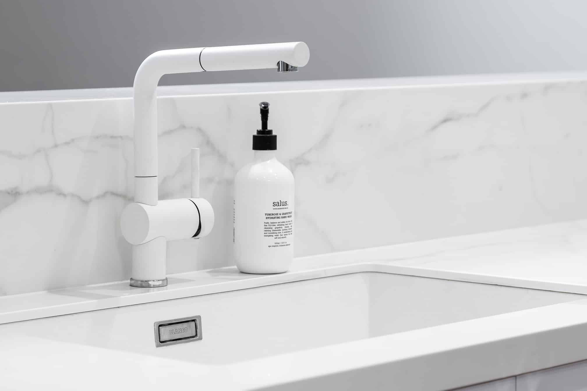
When you’re restricted with benchtop depth, you want to source a sink mixer that can work with the space. For this kitchen design, we sourced a mixer that only moved forwards, rather than backwards so that it could be placed right back, almost against the splashback to fit in the undermount sink.
Hidden Electrical & Charging Station
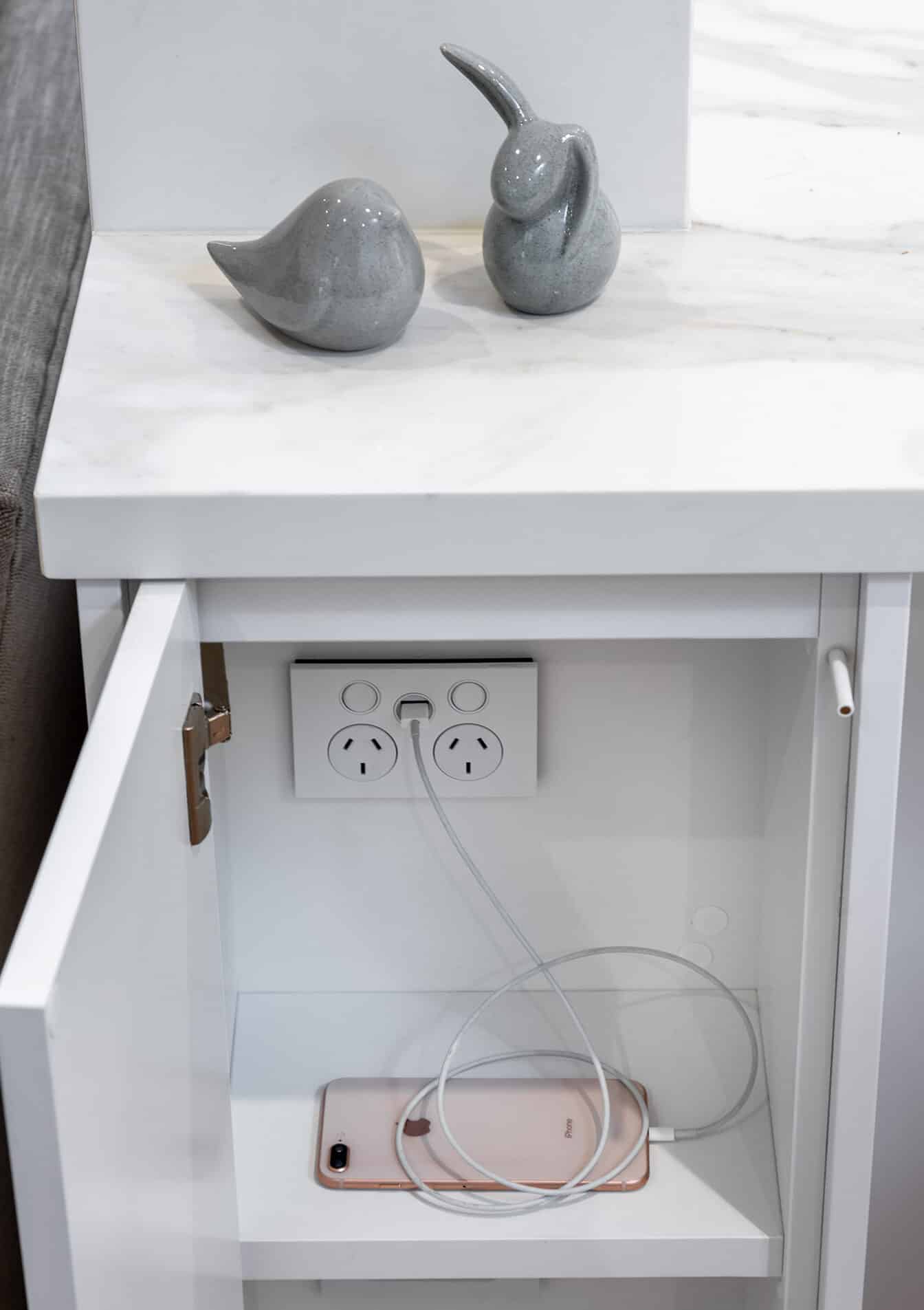
With the previous pile of electrical that used to sit on the bench, we extended the benchtop to the end of the kitchen pillar and created additional cabinetry underneath to host the WiFi modem, electrical cords plus included a charging station and GPOs.
Recent projects
Lux Interiors is passionate about creating premium bespoke renovations to suit our client’s desires, budgets, and unique requirements. View some of our latest renovation projects – designed and renovated with care and precision by our design & build team.