Pine Tree
SHAKER STYLE KITCHEN RENOVATION
In Collaboration with Carmen Hansberry Design
CLIENT BRIEF
Our clients were after a contemporary, seamless flowing kitchen that utilised every inch of space and enhanced the bountiful amount of natural light that fills the space.
Requests:
- Removal of built-in corner pantry and create a separate accessible and functional pantry storage
- Incorporate casual seating space for at least 4 people comfortably without interrupting the flow of the kitchen
- Appliance storage to keep the kitchen looking neat and tidy
- Create a tech hub for existing items such as a Google Home, TV, automation and security devices
- Update the current kitchen “drop zone” to incorporate storage, a pin-up board and a desk. Ensuring it is consistent with the kitchen’s style and not look “bitsy”
Before
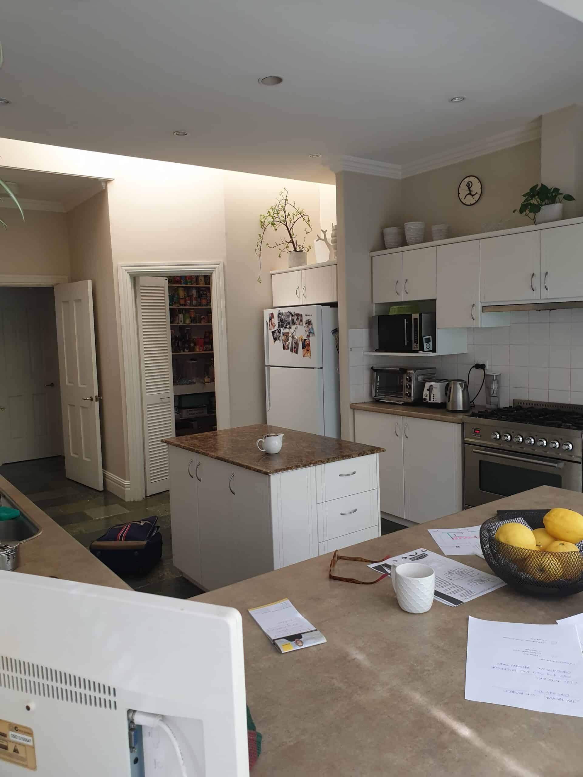
Previously this kitchen was outdated, and the layout was crammed and pokey. There was a built-in corner pantry, which took up more space than needed. The kitchen had an existing trail of skylights which were incredible for natural light, but also opened onto the sunroom which instead of adding more natural light, it drowned the space in heat.
After
This project was a collaboration between Carmen Hansberry Design and Lux Interiors.
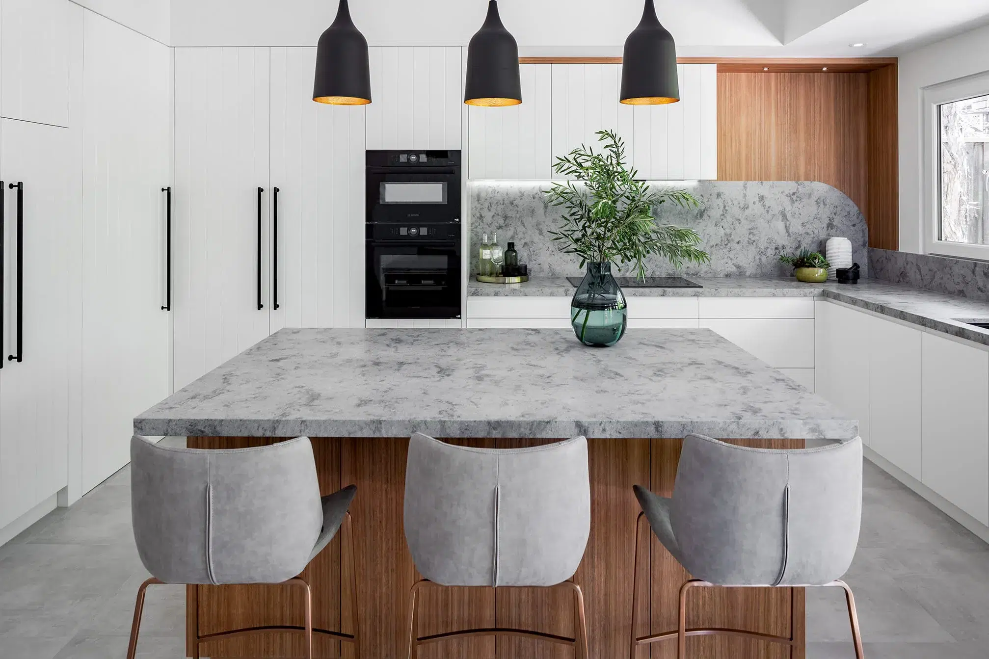
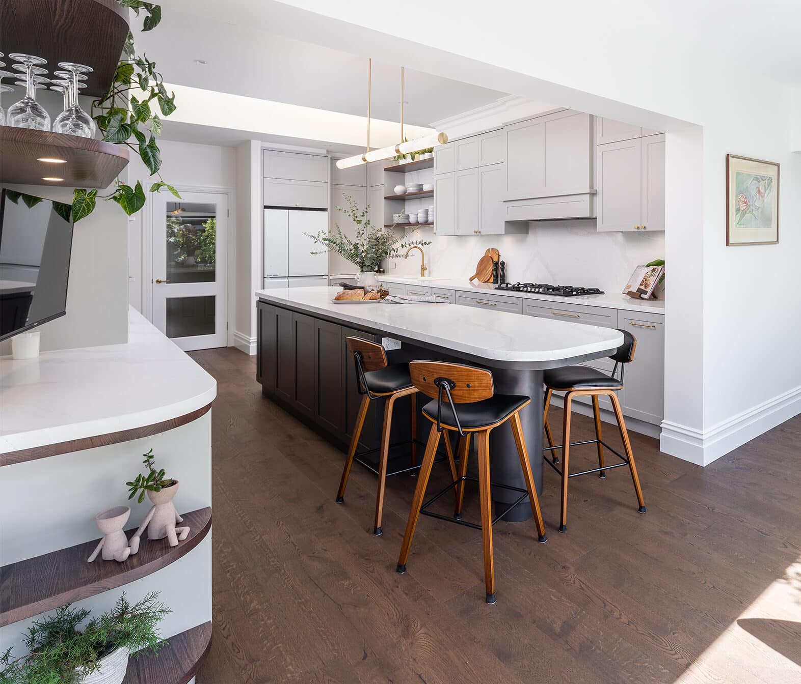
Carmen’s design opens up the space by removing the built-in corner pantry to square off the room and creating a custom island bench that sits in the centre and runs the length of the room, flowing seamlessly into the alfresco dining area. The neutral colours of the surrounding cabinetry combined with the warm timber flooring and shelving create a relaxing feel to the space. This is carried through to the curves in the island bench that soften the bold colour in this statement piece. This kitchen is now truly the heart of the home with its optimised design, quality workmanship and a plentiful amount of storage and bench space.
Cabinetry Design
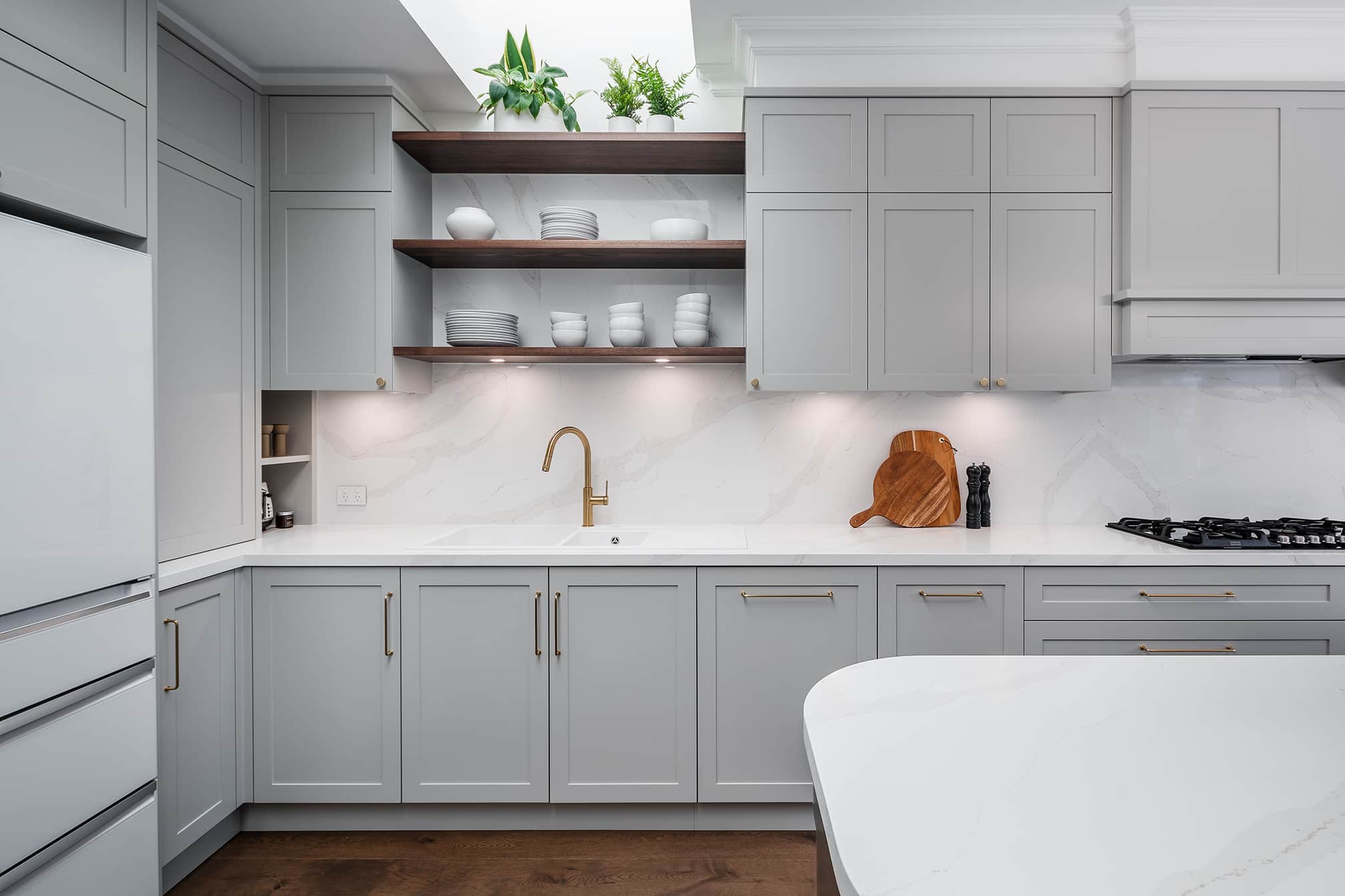
In the beginning of the design process, we worked closely with Carmen to determine the key structural areas of the room. Once it was established the proposed demo building works could easily be carried out. Carmen was able to design the whole space as a clean canvas. Knowing the flooring was being modified too, it really provided a blank space to make recommendations like moving the sink to same run as the cooktop. Doing this meant creating a great workflow between the sink and cooktop while also creating the perfect space on the left-hand side for tall pantry storage.

As part of the cabinetry design, a mixture of base cabinets and tall overhead doors was recommended to break up the cabinets, so that the tall overhead doors could be set back ever so slightly. Having shallower cabinets, ensure the cabinet for everyday pantry food was the perfect depth so items couldn’t get lost at the back.
You’ll notice that the edge profile on the cabinetry is a mitered edge, which is where the two fades are cut to a 45-degree angle to seamlessly join together. This would have to be one of our favourite finishes, and although requires more expertise and precision, it presents a beautiful finish.
Natural Light
To allow optimal natural light to flow through the kitchen and surrounding rooms, we changed over the two interior doors to glass pane doors and removed the old blinds in the existing skylights. In addition, we replaced the sliding doors that opened out to the alfresco, to new larger glass doors that consequently brought in more daylight.
Island Bench
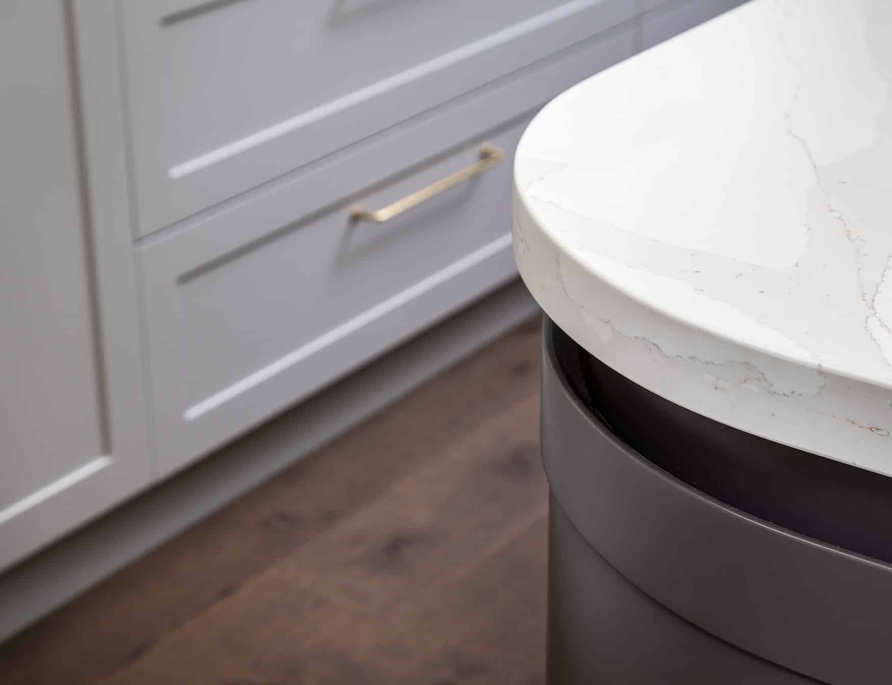
This custom large island bench features a Caesarstone benchtop, bold cabinetry and a 300mm diameter leg at the end to allow for seating space. The curves are the clear highlight of the island with both ends featuring a 250-degree radius, with a recessed gap that joins the curved cabinetry in a Hampton’s profile.
The addition of the island has transformed the whole kitchen into a galley kitchen. By doing this it ensured that in the instance of entertaining, the kitchen workflow would not be interrupted, together with having a curved end, it makes the space easy for 4 x adults to sit comfortably and not on top of one another.
With storage on both sides of the island and casual seating at the end, this island has become a key piece of furniture in our clients’ home and one that gets used most of the day, every day.
Drop Zone
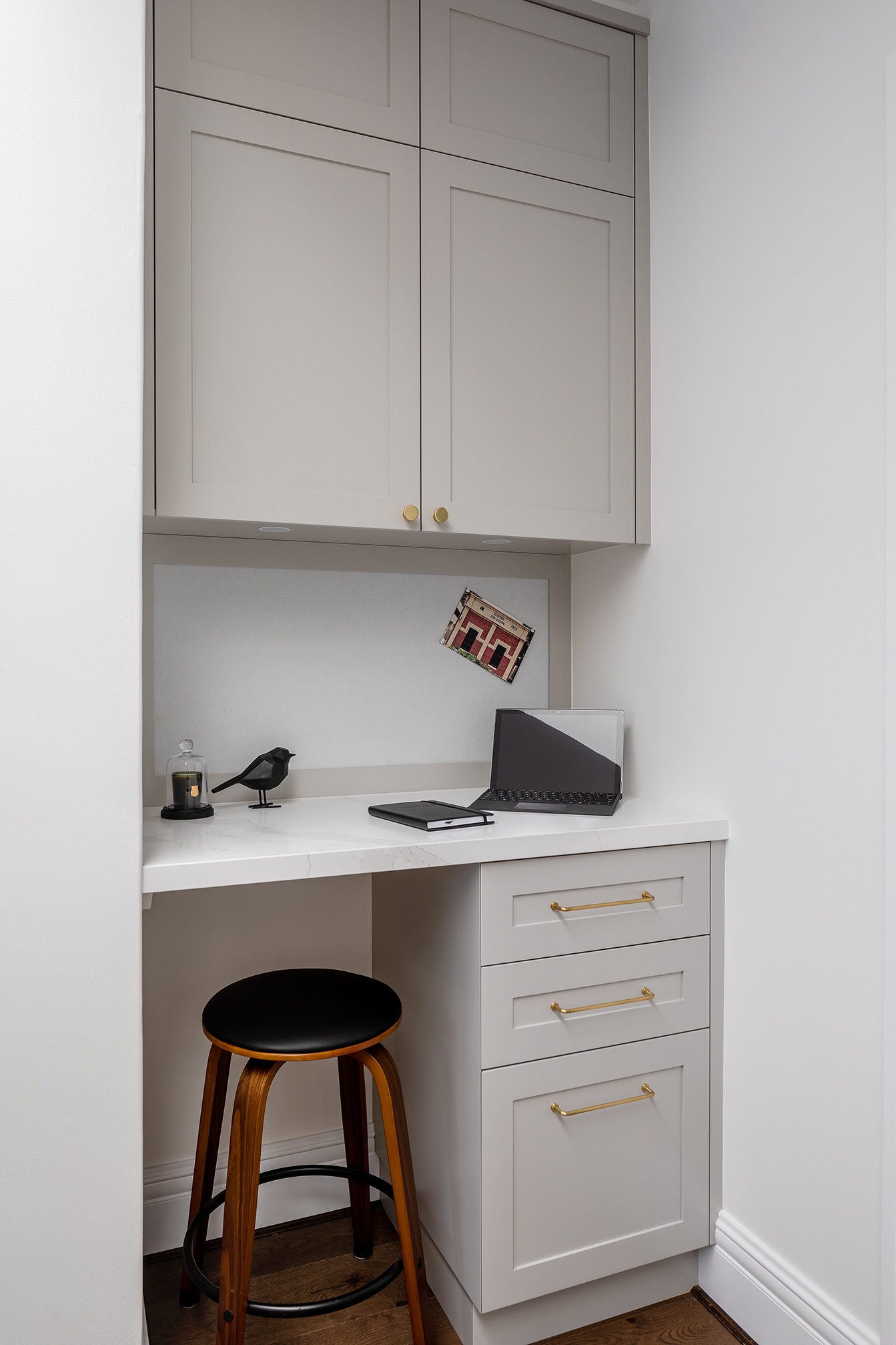
Often known as the dreaded drop zone, you know that one area in your home that, if not designed properly, is cluttered and the space where everyone seems to come in and drop all of their belongings. In this design, Carmen accounted for the drop zone by creating an area as soon as you walk into the kitchen that provides bench space, plenty of storage and a notice board. For this space, the benchtop runs at a higher, useable height and we have built-in a drop file drawer for everyday mail and bills. At the rear of the desk is a pin-up board with plenty of benchtop space so that this can act as a functional working space, in addition to the clients’ existing office.
Recent projects
Lux Interiors is passionate about creating premium bespoke renovations to suit our client’s desires, budgets, and unique requirements. View some of our latest renovation projects – designed and renovated with care and precision by our design & build team.