Marco Polo
CLIENT BRIEF
Our clients came to us wanting a kitchen that entertains well with the rest of the living areas but also allows privacy for the chef.
Requests:
- Plenty of bench space
- Make the kitchen feel more cohesive with the home and less secluded
- A bar
- Accessible access around the kitchen
- Style to match a sky-high apartment on the Marina
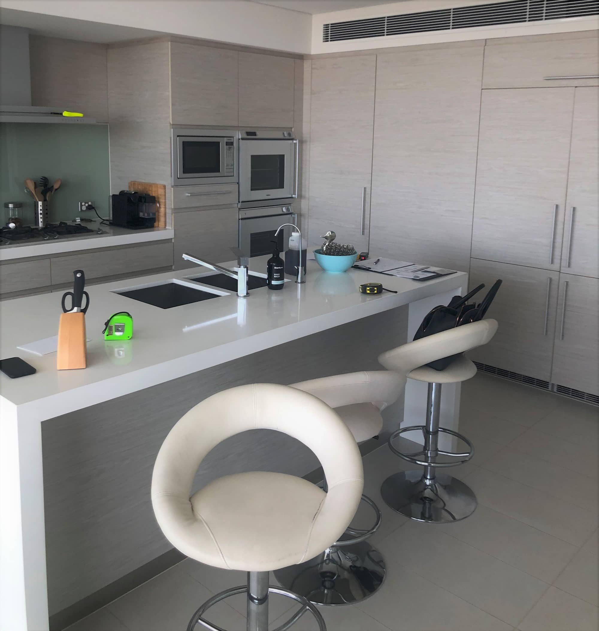
Before
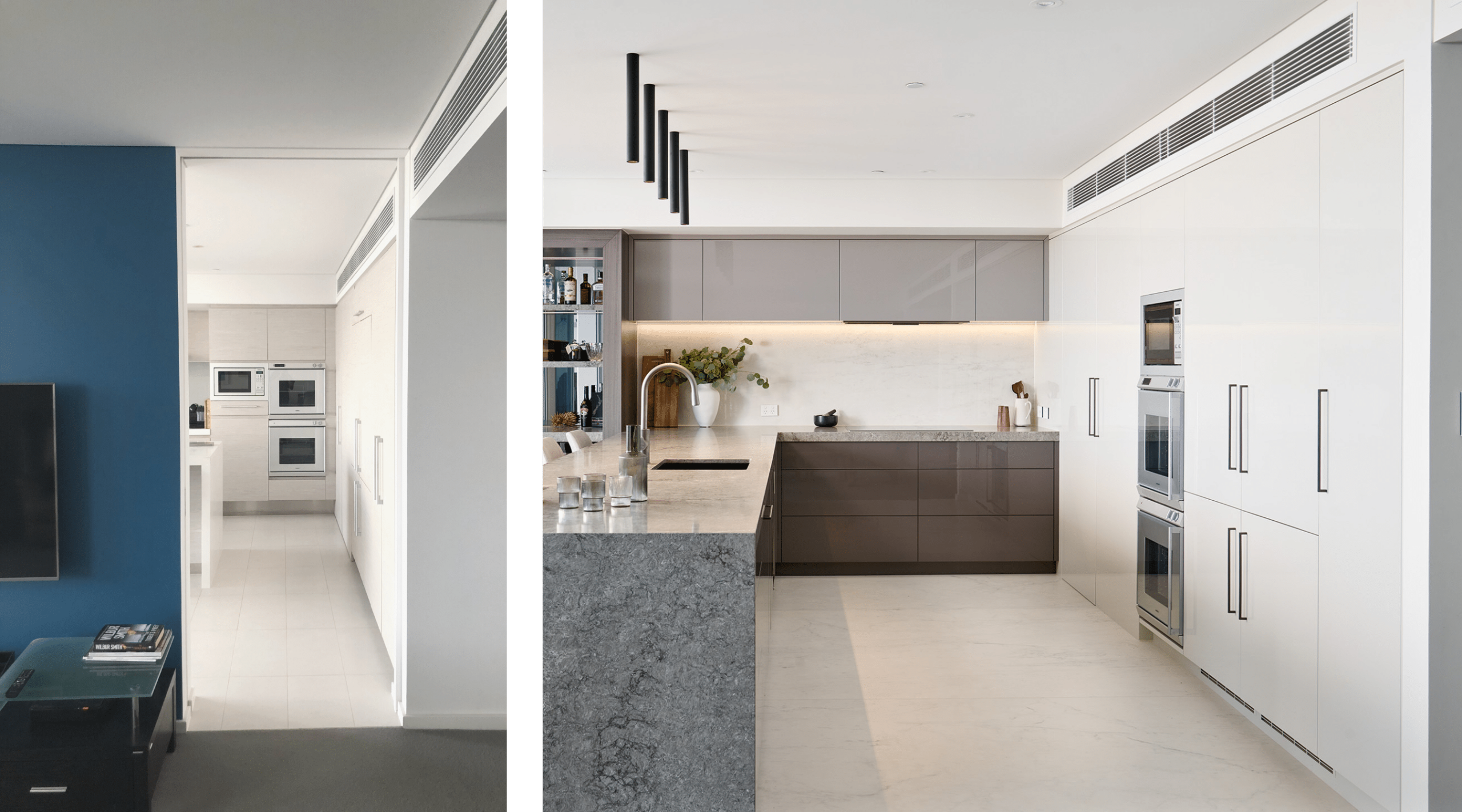
Previously this apartment kitchen was closed off from the living and dining areas with an internal dividing wall. The kitchen layout was oriented to face the dividing wall, with the stove, appliances and sink on the back wall, meaning the chef’s back was facing the guests. This layout secluded the kitchen from the rest of the living areas and wasted the beautiful view to the Marina.
After
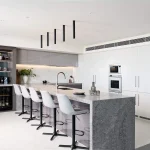
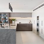
This moody, New York City vibe apartment kitchen was created for an existing client who was after a space that could entertain visitors but also allowed privacy within the kitchen. The layout needed to incorporate accessible access in and around the kitchen and living areas to work in the rest of the accessible home.
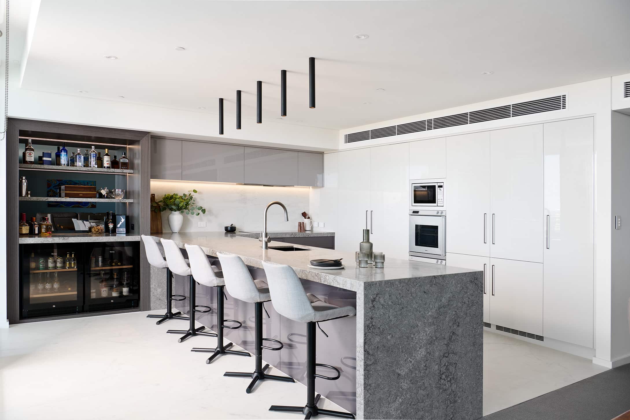
Open Plan Living
In our design, we removed the internal dividing wall that was placed where the current end of the peninsula bench is to allow better flow between the living, dining and kitchen area. This opens up the room and lends itself to entertaining in a communal and inviting space.
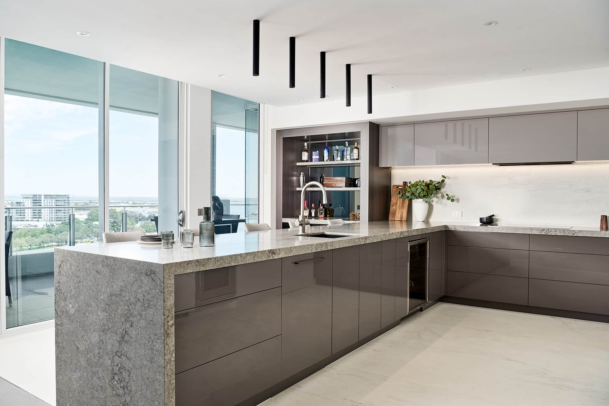
Cooking with a View
We shifted the orientation of the kitchen to face the beautiful view over the Mandurah Marina which encourage visitors to stay on the outer side of the kitchen, roaming from the living areas to the balcony and over to the bar, whilst allowing the chef their privacy inside the kitchen.
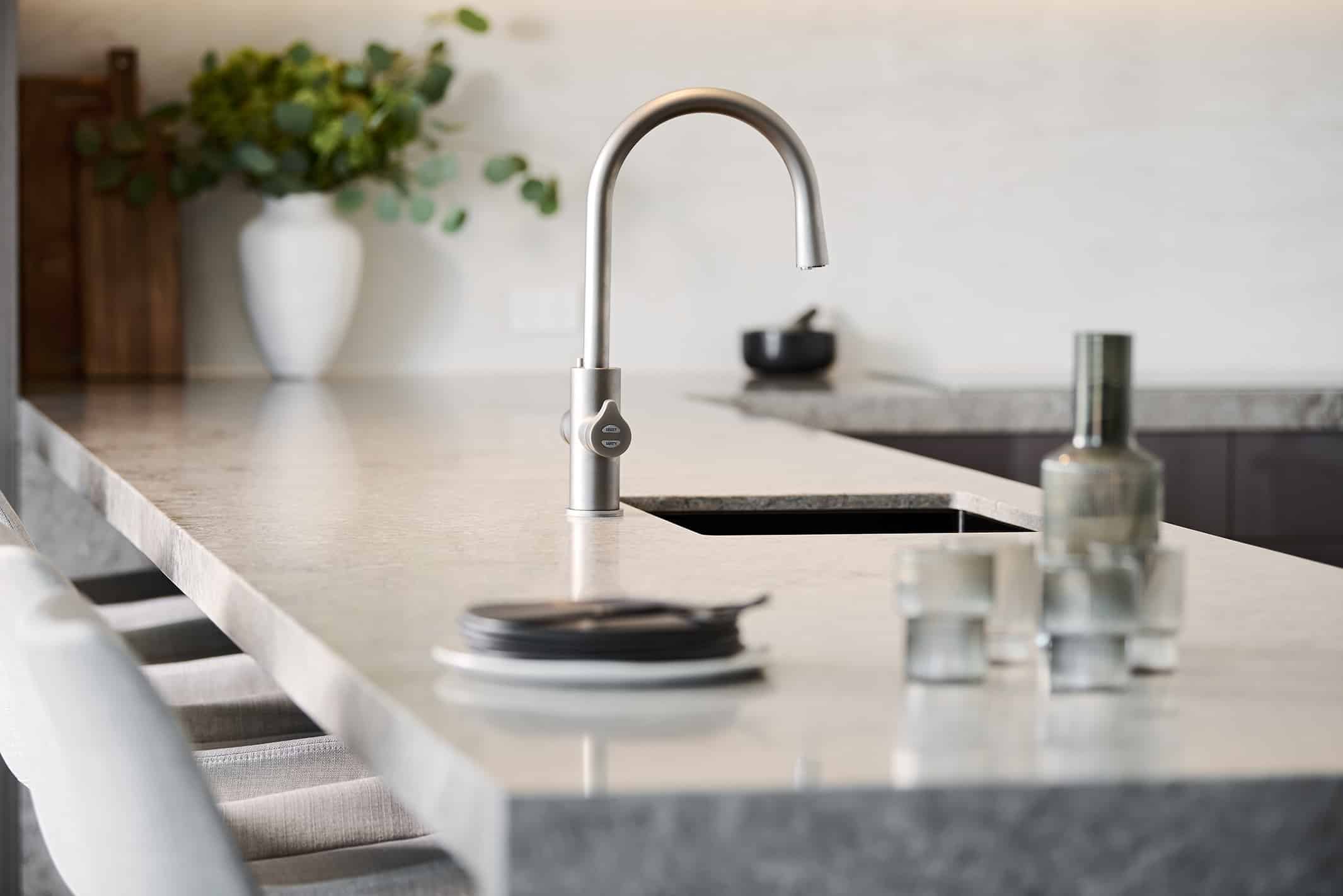
Space Creation
To create additional storage and space within the design, we shifted the appliances to the back wall which allowed us to move the stove across and add in a bar, without losing any bench space. The benefit of using a peninsula bench, rather than an island in this situation was privacy from visitors, additional bench space and additional under bench storage.
There are many small details that were taken into consideration with this design, one specific detail was the removal of a double thickness wall into a single thickness wall at the entry of the kitchen which saved 120mm. This minor change led to significant gains for the owners. It allowed for a wider view point from the entry hallway into the now-open living kitchen that flows onto the balcony, as well as meant that the cabinetry on that back wall could be the same width for each panel rather than various different sizes.
Recent projects
Lux Interiors is passionate about creating premium bespoke renovations to suit our client’s desires, budgets, and unique requirements. View some of our latest renovation projects – designed and renovated with care and precision by our design & build team.