Huntriss – Ensuite
Monochrome Renovation
CLIENT BRIEF
Our clients wanted a monochrome, functioning ensuite that felt larger than it was.
Requests:
- Larger shower
- Larger vanity
- Monochrome style that also allows plenty of light.
Before
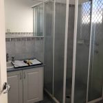
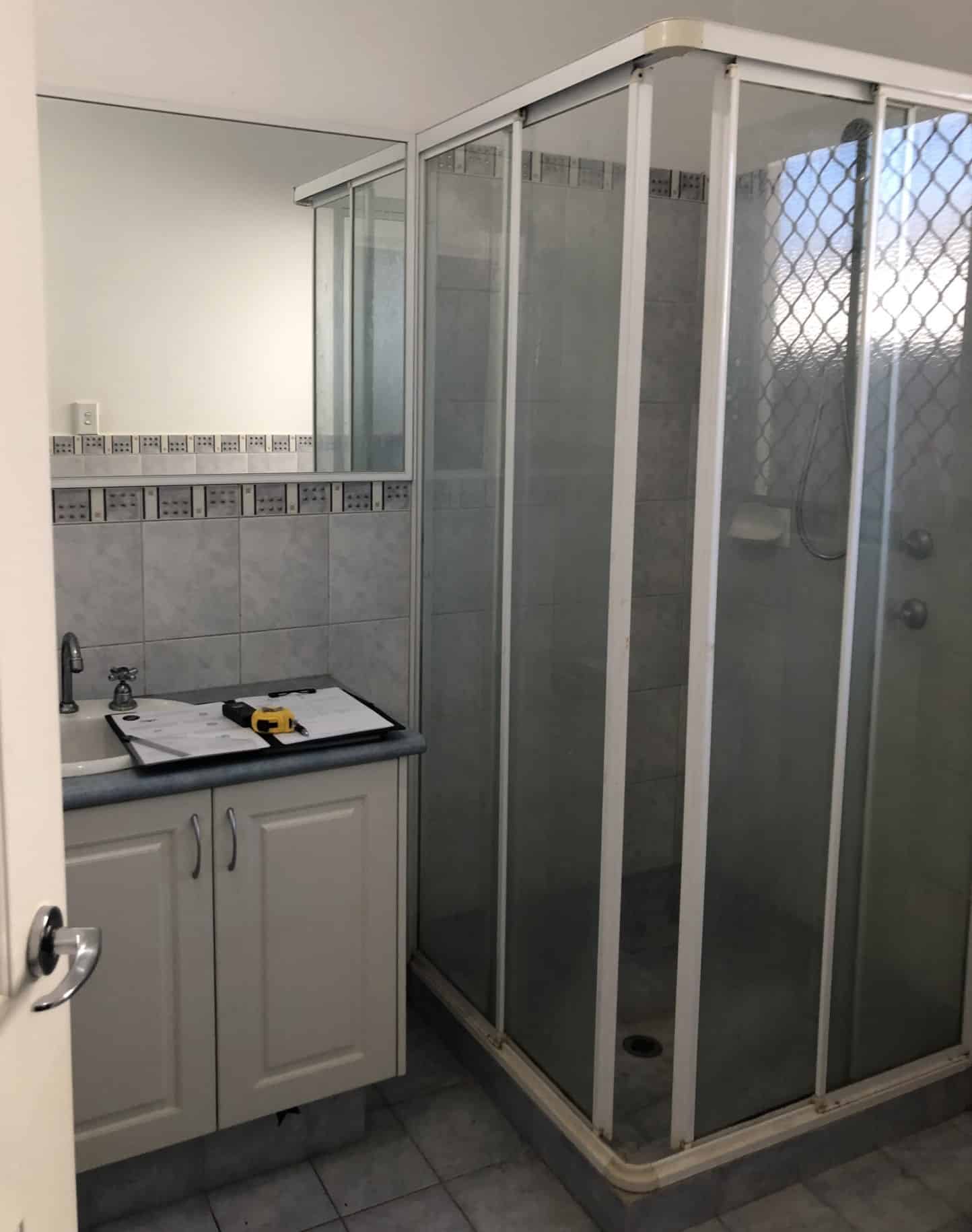
Previously, this ensuite was outdated and lacked flow and functionality. It was also hard to clean with the small gaps between the vanity and shower, and the fully-framed corner sliding shower. The old honeycomb security screens meant that the natural light was also limited.
After
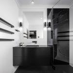
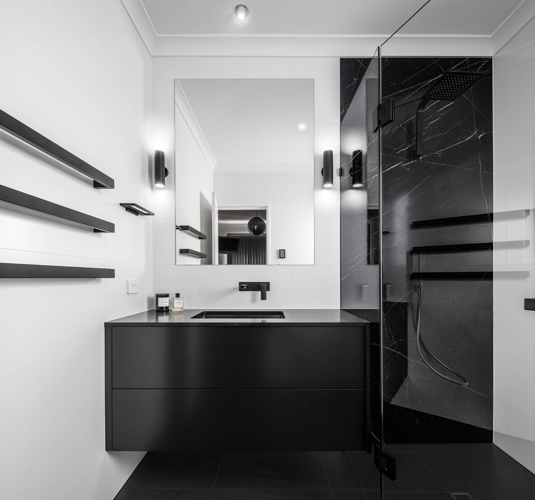
Working within the existing space, we wanted our design to utilise every inch of space, adding purpose, functionality and storage to the ensuite. We eliminated any gaps between the vanity and the shower by extending the vanity and placing the shower screen hard up against it. To do this, we created a waterfall edge on the benchtop to allow the shower screen to be siliconed around the vanity to fill any gaps.
Vanity Details
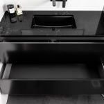
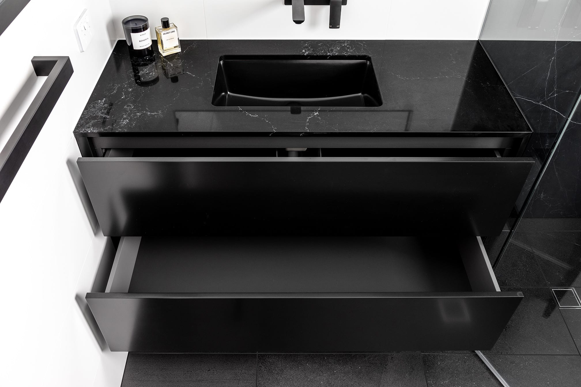
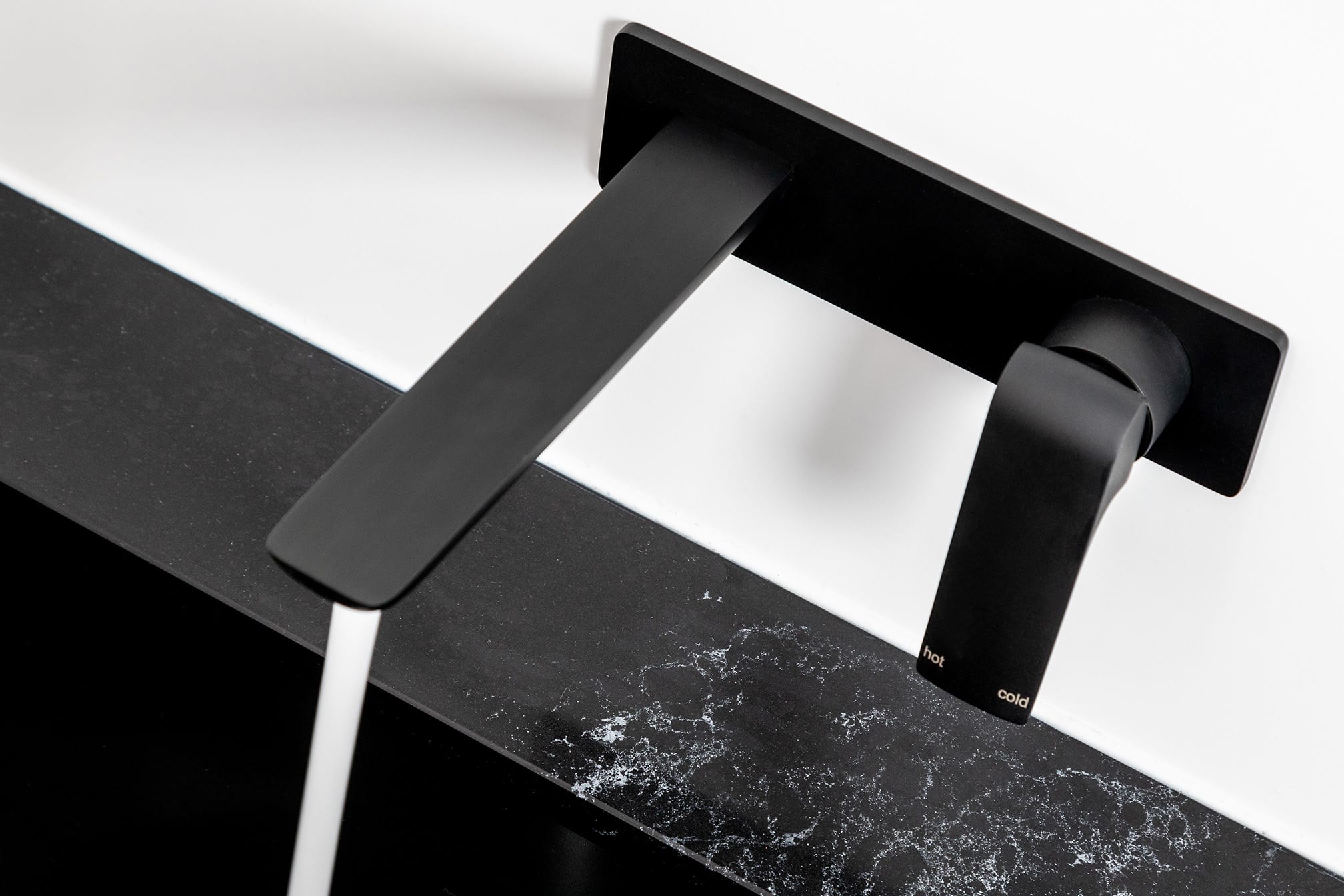
We designed a custom wall hung vanity that was sleek in design with double drawers in 2pac satin black. The intention of a wall hung vanity is to create an illusion that the space is larger because you can see more of the floor surface area. Part of our brief was to make the room feel larger than it was, so the wall hung vanity worked perfectly. The vanity is paired with black tapware and a black undermount basin.
Shower
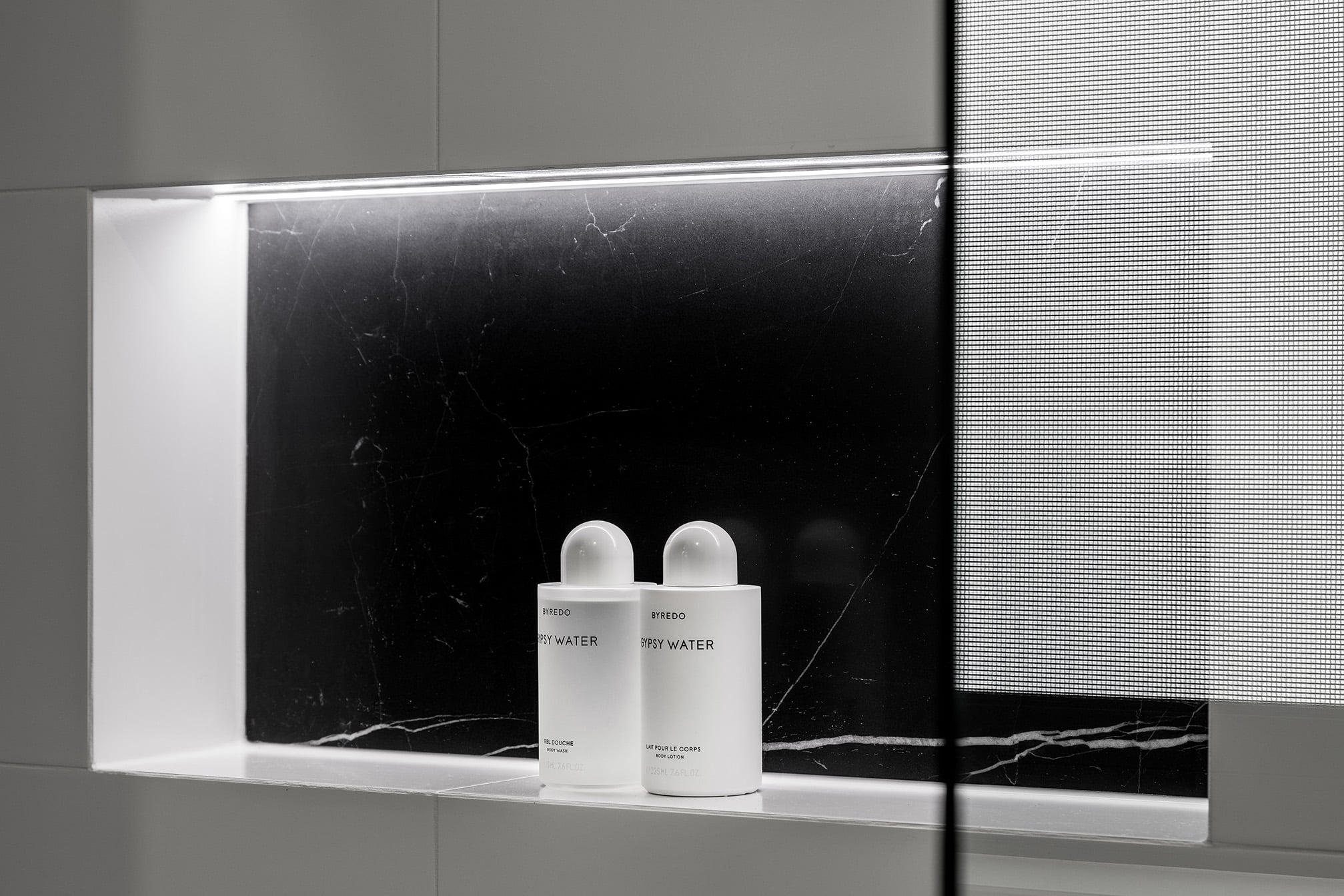
We designed the shower to utilise maximum space without splashing onto the rest of the room by creating an angled designated space with a glass door. The shower features a stone look porcelain panel with black tapware. We were able to create a recessed niche on the external wall that is backlit.
Accessories
Keeping in line with the monochrome theme of the home, we recommended black double ended wall sconces above the vanity, black heated towel rails with digital timer and black hinges on the shower screen. All balanced with the white wall tile and plenty of light.
Recent projects
Lux Interiors is passionate about creating premium bespoke renovations to suit our client’s desires, budgets, and unique requirements. View some of our latest renovation projects – designed and renovated with care and precision by our design & build team.