Barnes Innaloo
Visually Harmonising Design
INNALOO KITCHEN RENOVATION, PERTH WA
CLIENT BRIEF
The goal of this project was to achieve an open kitchen with bold monochrome contrasts.
Requests:
- Symmetrical design
- Lots of hidden storage
- Minimal joins/ grout
- Sleek look
- Modern take on traditional
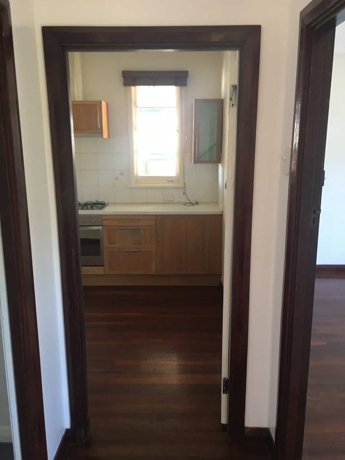
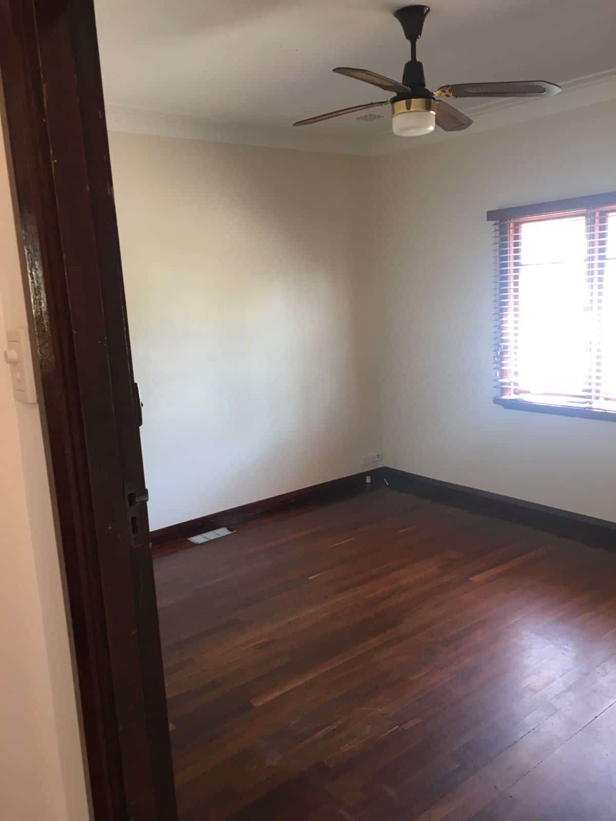
Before
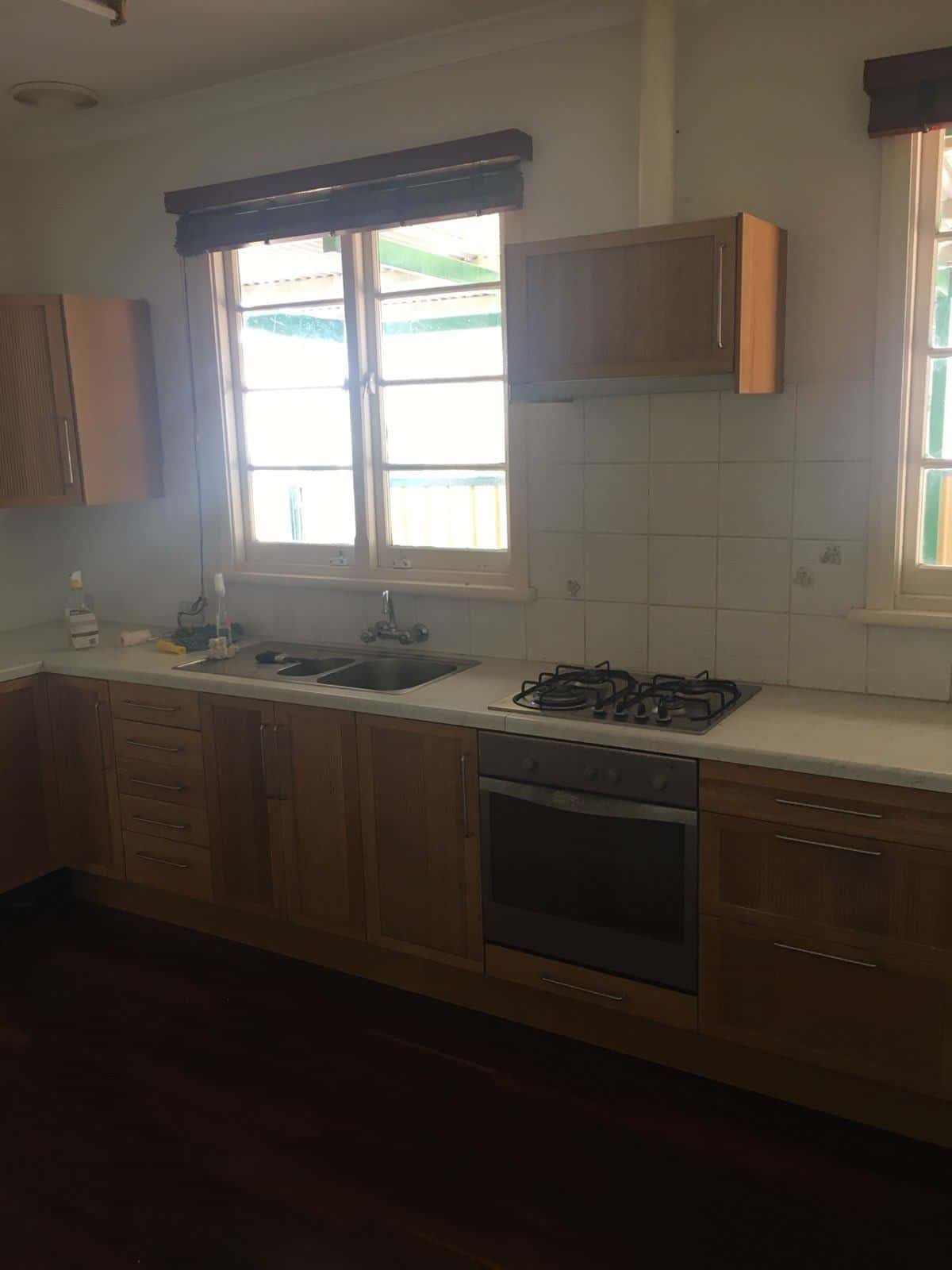
Prior to the renovation, the style of this Innaloo kitchen lacked natural light and felt out of place compared to the rest of the home. To better utilise the available space, the kitchen location was moved across the house.
Symmetrical Design
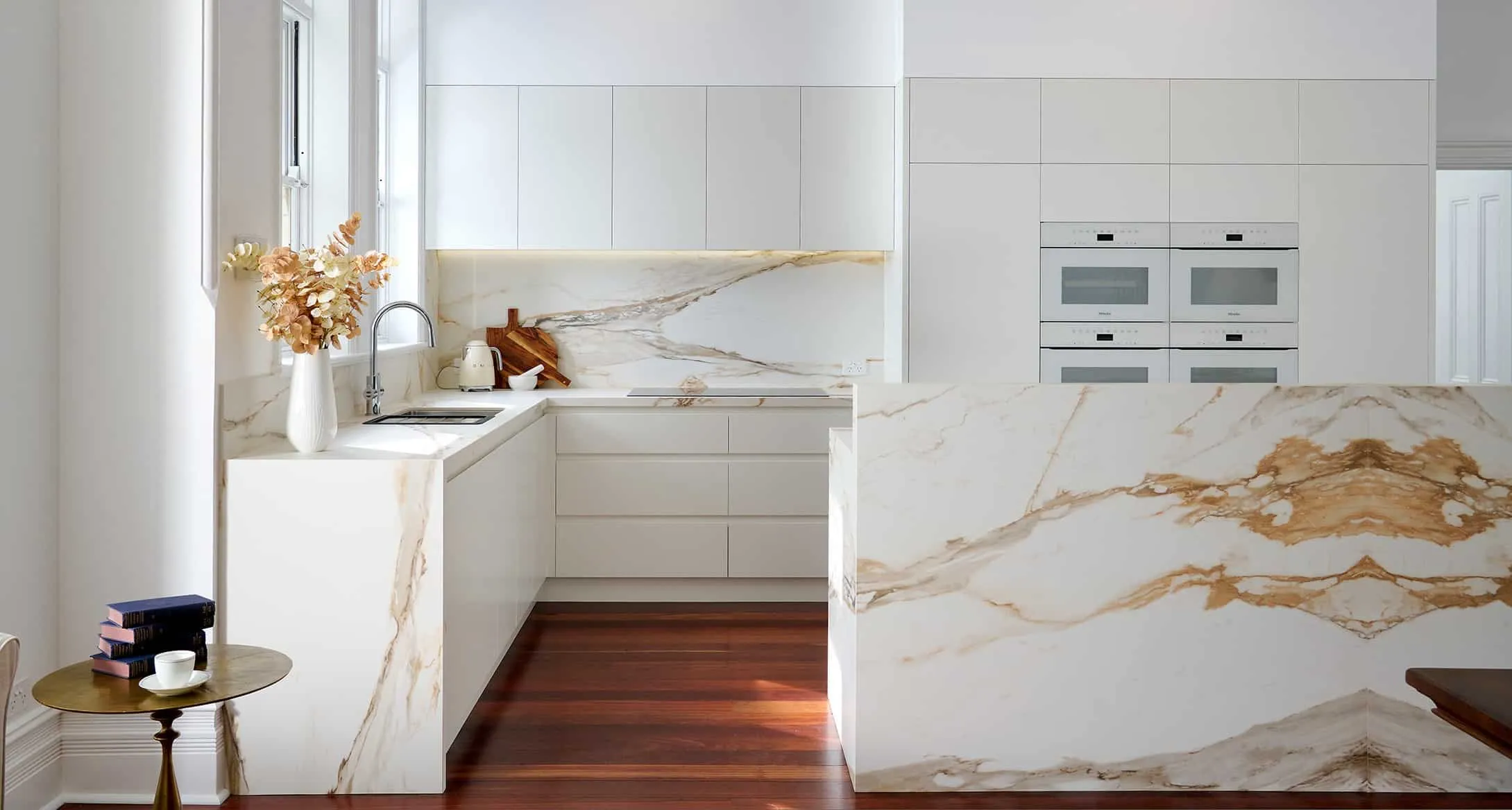
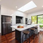
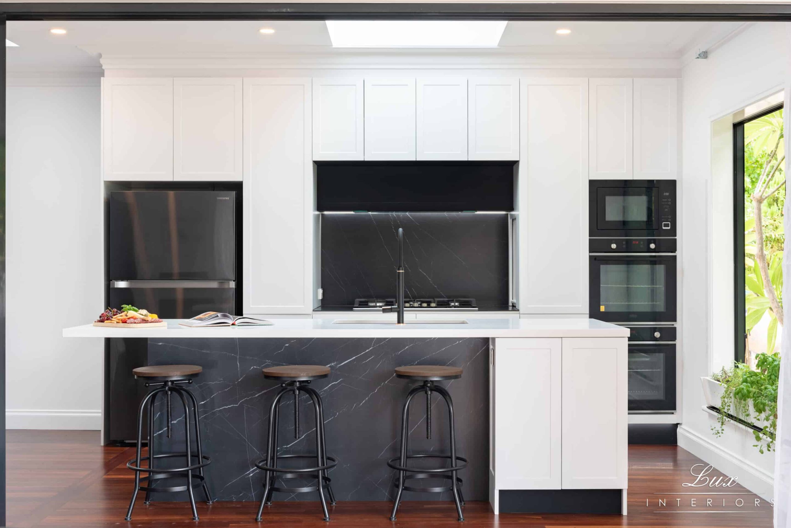
The symmetrical design of the kitchen provides ample storage solutions and creates a visually harmonising design. The kitchen boasts copious bench space with a large island bench centred within the kitchen area.
Enhanced Natural Light
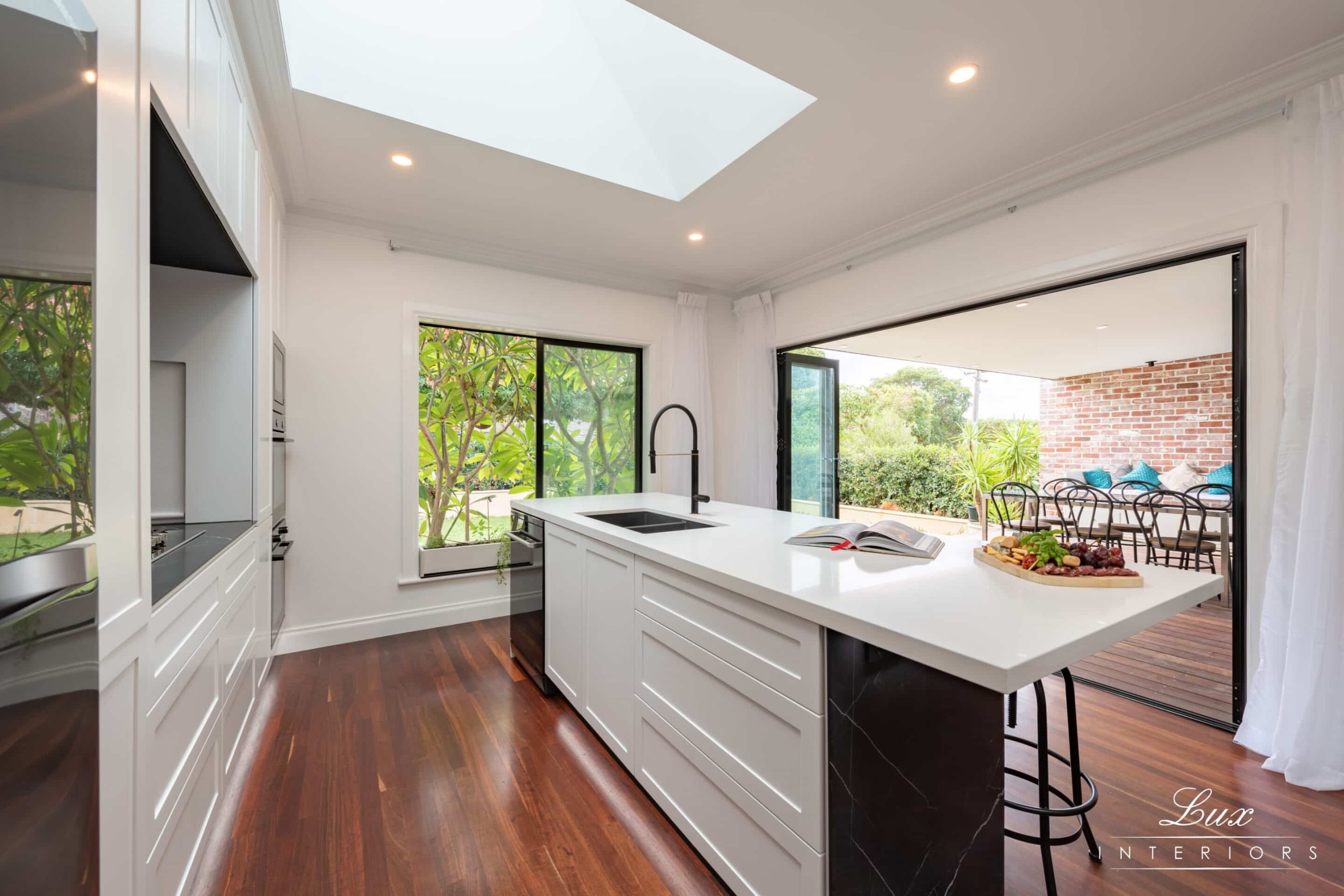
A Velux skylight window installed centred to the kitchen cooktop allows masses of natural light to filter into the room and creates perfect symmetry tying in with the cabinetry design.
Contemporary Finish
Using Nero Marquina porcelain panels to the front of the island cabinet, on the cooktop bench and splashback provides the perfect contrast against the white cabinetry and gives the kitchen a modern contemporary feel. This product was also selected because of its ability to create a minimal fine edge along the front of the benchtop. The inclusion of 5k strip lighting accentuates the vein patterns running through the panels which ties in with the white cabinetry.
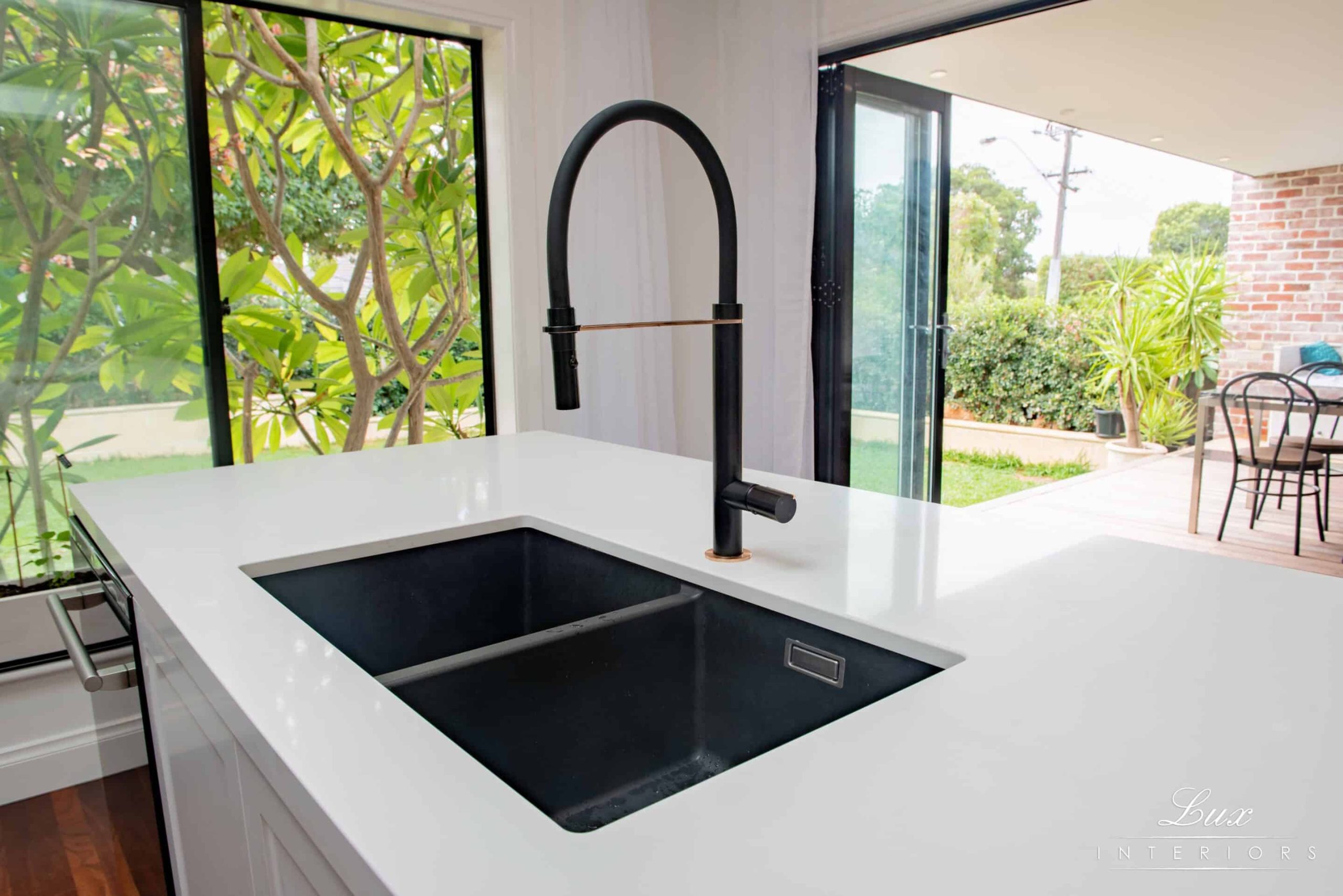
Careful considerations were made when selecting appliances. The selection of black appliances contrast against the white cabinetry whist complimenting the accents of black within the kitchen design. The integrated microwave and ovens provide a slimline, sleek look to the cabinet.
Recent projects
Lux Interiors is passionate about creating premium bespoke renovations to suit our client’s desires, budgets, and unique requirements. View some of our latest renovation projects – designed and renovated with care and precision by our design & build team.